This home is all about the views; and luxe-boho decor.
A married couple wanted a weekend getaway house for themselves and their two young children. After building their home at the far end of Sonoma County's Alexander Valley wine country, they brought in Dawn Carlson and Carol Perry of Oakland-based MAS Design to fashion the interior.
The pair, who had started work on the couple's San Francisco home when they were asked to step into this project, understood that their clients' aesthetic was "uber modern," Carlson says. The isolated, rustic Sonoma setting, however, was the perfect foil for the designers' "organic modern" approach of "softening up the minimalist modern aesthetic with pieces that have a meaning and a story," she says. "The texture and juxtapositions are what our firm loves to do." There is a twist to this tale, however. Just as the house was completed, the media executive husband and journalist wife had to relocate to Tokyo with their kids. His parents are the current lucky inhabitants.
Houzz at a Glance
Who lives here: The house is owned by a couple in their 40s with two elementary-school-age children; his parents currently live in it.
Location: Cloverdale, California
Size: 3,500 square feet (325 square meters); four bedrooms, 4½ bathrooms
Designers: Dawn Carlson and Carol Perry of MAS Design
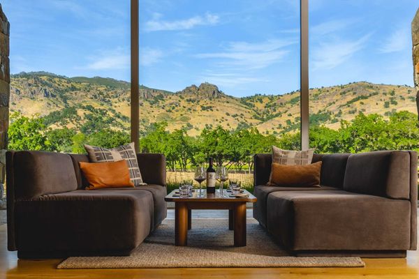
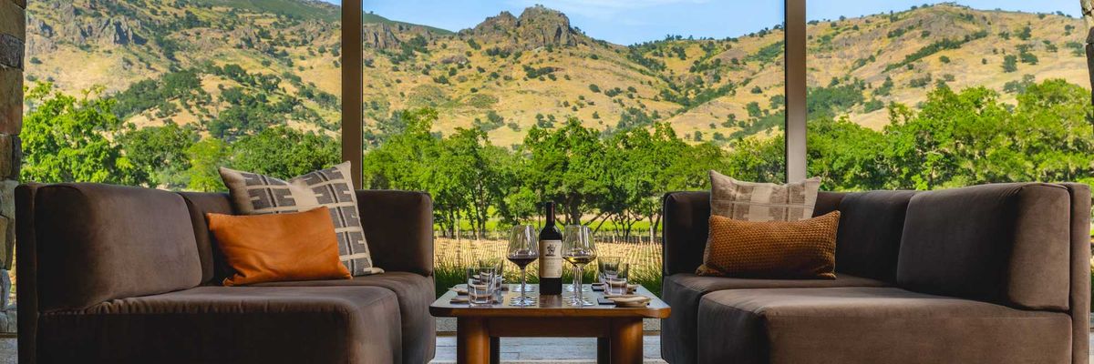
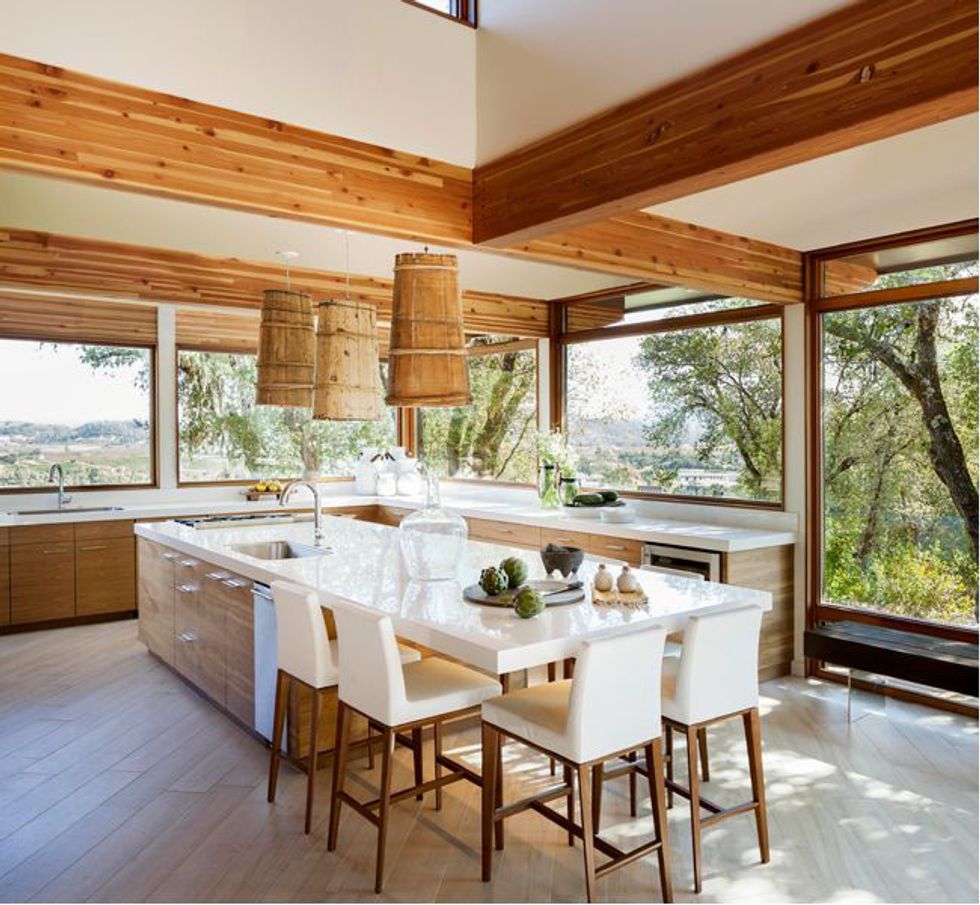
"It is completely about the views," designer Dawn Carlson says of the architectural shell she and Carol Perry stepped into. The house, with its broad window walls and fixed transoms, was designed to connect as fully as possible with the pastoral landscape outside. The use of exposed Douglas fir beams throughout deepens the link to the woodsy surroundings.
For Carlson and Perry, the clean-lined space was the perfect canvas for their masterly juxtaposition of natural and modern elements. To give the space a sense of flow and cohesion, the designers selected a series of fundamental elements that would run throughout the first and second stories of the house: crisp white walls, surfaces and accents; grain-imprinted porcelain floor tile set on a diagonal; a variety of beautiful woods chosen to not compete with the Douglas fir. Keeping the palette light and neutral throughout the house minimized distractions and allowed the eye to move beyond the walls to the outside. The drama comes from the intricate interplay of textures and materials, soft and hard, rustic and stylized. "We let the materials speak for themselves," Perry says.
The kitchen is a prime example of their "organic modern" approach: mellow, natural wood cabinetry is the natural foil for glossy white counters and the 14-foot-long cantilevered island top, both made from ultra-durable porcelain; "comparable to granite in bulletproof-ness," Carlson notes. The modernist leather counter stools share space with unique lighting fixtures that in another place and time were Tibetan water carriers. The homeowner "was clear he wanted to have special pieces that had a story and came from somewhere," Carlson says. "They give the home that heritage feeling on top of the clean, modern look."
The kitchen at night is softly illuminated in two ways: from above by the wooden pendants and from below by the strip LED lighting installed under the island counter. The white leather seats, functional and durable for the children in the house, keep the eye gliding over the bright-white surfaces without stopping.
The wife is Japanese, and Carlson and Perry incorporated a blend of Asian elements into the design. One of those, evident in the Tibetan water carrier pendants, is the concept of wabi-sabi, an aesthetic based on the beauty of imperfection and the sense of transience in materials. Wabi-sabi fits hand-in-glove with MAS Design's organic modern approach and informed many of the designers' choices.
Organic modern in a nutshell: The engineered perfection of the porcelain countertop crowns the richly hued black walnut cabinetry, book-matched to allow the beauty of the wood's natural grain to flow uninterrupted.
The Tibetan water "backpacks," a serendipitous find in a local shop, were the starting point for Carlson and Perry's kitchen design. "We find our lighting and build around that," Carlson says. "They are the jewelry of the home." The pendants are all different, "perfectly imperfect, naturally stunning, the focal point in that room," she says. They blend seamlessly with the wood-paneled cabinet and refrigerator and the oven wall. The island includes a prep sink and a cooktop, whose shallow ventilation hood is hidden behind the overhead beam so as not to obstruct the view.
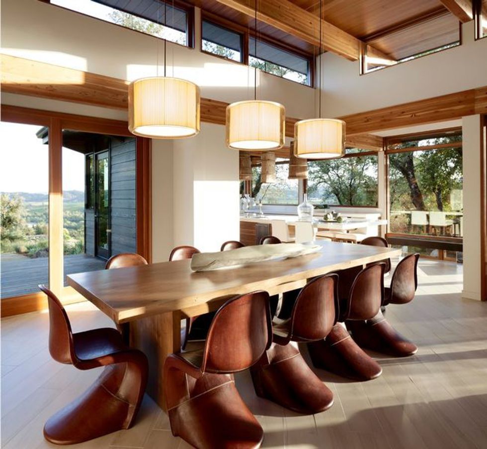
The dining room, positioned to enjoy the expansive view, is a study in motion, with sinuous Slither chairs upholstered in leather dancing around the solid wood table. The hand-stitched leather gives the chairs' modern silhouette a rustic yet elegant look as well as warmth. The pendants again speak to Carlson and Perry's devotion to contrasts. "We love the juxtaposition of the cotton pleated interior and the hard blown-glass exterior," Carlson says of the lighting, "the juxtaposition of hard and soft, modern and a more hand-rendered feeling."
The beautiful leather-clad chairs — the epitome of form meeting function — are art pieces in their own right. "The client had a desire to see a lot of natural texture," Carlson says. That meant "keeping it natural and focusing on the sculptural element of the furniture, instead of 'this is red.'"
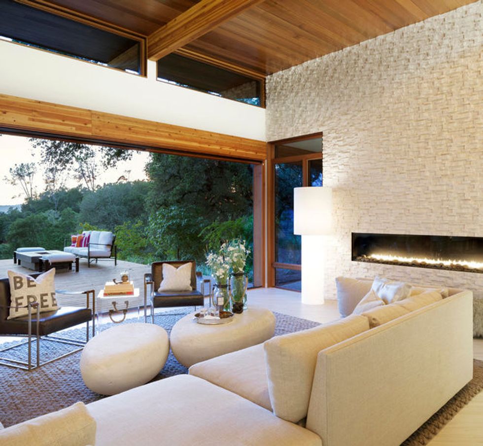
"The living room speaks to the whole indoor-outdoor concept, true California living," Carlson says. "Literally, you are indoors and outdoors." Three massive 9-foot-wide sliding glass doors stack as they open the entire wall to the patio, which becomes an extension of the living room space.
The decor epitomizes the credo of MAS Design (short for Mood and Space) of juxtaposing the modern and the organic. The centerpiece is the brilliant-white 25-foot-wide limestone stacked-stone wall with 7-foot-long horizontal gas fireplace. "That was the statement in the room," Carlson says. "It's so dramatic without being distracting. It's there without being oppressive."
Set against the wall's chiseled facade are soft elements such as the cushy sectional, custom hand-woven chunky wool rug and Mongolian wool poufs. The pair of square-lined, weathered-leather chairs play off a pair of round-edged faux riverstone coffee tables made from a lightweight resin-stone composite. A floor lamp is completely swathed in linen — "a softening of what would be a really modern moment," Carlson says. Ditto the Lucite trunk table between the leather seats, which boasts, somewhat tongue in cheek, rugged rope handles.
Smooth faux stone meets chunky sweater-style hand-woven rug.
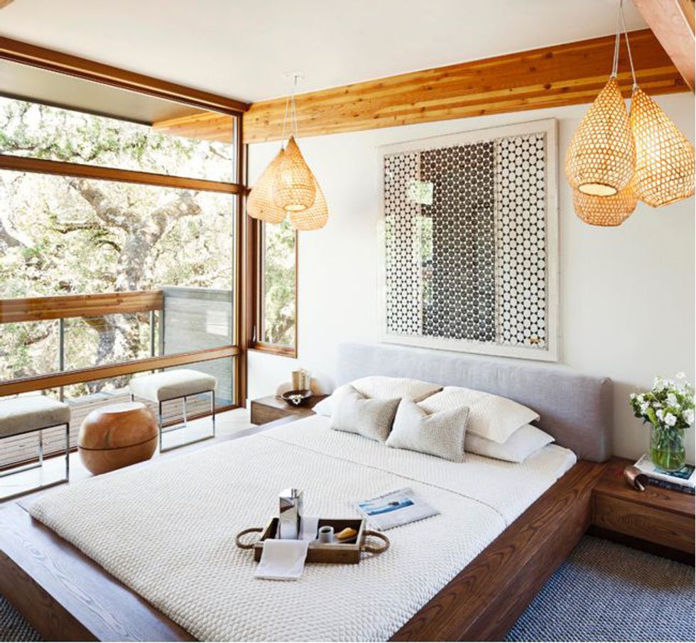
"It was a serenity vibe we were going for," Carlson says of the airy second-floor master bedroom. The subtle interplay of patterns and textures in the natural materials speaks to the wife's Japanese heritage. The custom ash wood bed, fabricated in Oakland, is a "takeoff of a Japanese platform bed," Carlson explains, and features night-table wings that appear to be floating, as well as a hand-sewn, linen-upholstered headboard. The bed sits atop another custom-made, hand-woven, chunky wool rug.
Pendant lighting once again provides strong focal points as well as a cultural story: The rattan baskets, clustered in threes, are repurposed Indonesian fishing nets. A pair of chrome-frame stools covered in hide flank a mango wood stool that opens for storage. As on the first floor, the porcelain floor tiles are set on a diagonal, Perry says, so that "they float from one room into the other; it's not chopped up, which adds to the serenity."
The lighting fixtures made from Indonesian rattan baskets used by Sulawesi women to catch fish, now lined with rice paper, have the wabi-sabi look of perfect imperfection.
Lighting fixtures: Votive Bunch Light, Tucker Robbins
"We really love the artwork in here," Carlson says. The showpiece is a hand-woven cloth by a Senegalese artist, mounted in reverse to highlight the craftsmanship. Encasing this artisan piece in a Lucite frame was a conscious marriage of the modern with the traditional. The dueling geometries of the artwork and the custom pillows give off a subtle energy in the otherwise serene environment.
Woven artwork: "Biddew Noir" by Johanna Bramble, through St. Frank; custom pillows: Imperial Fret in Natural, Pindler + Pindler, fabricated by Kevin G Custom Upholstery
The master bath, with its oversize 72-by-36-inch tub, offers an expansive view of the countryside, which is relaxing and invigorating at the same time. The designers built shelving into one tub wall.
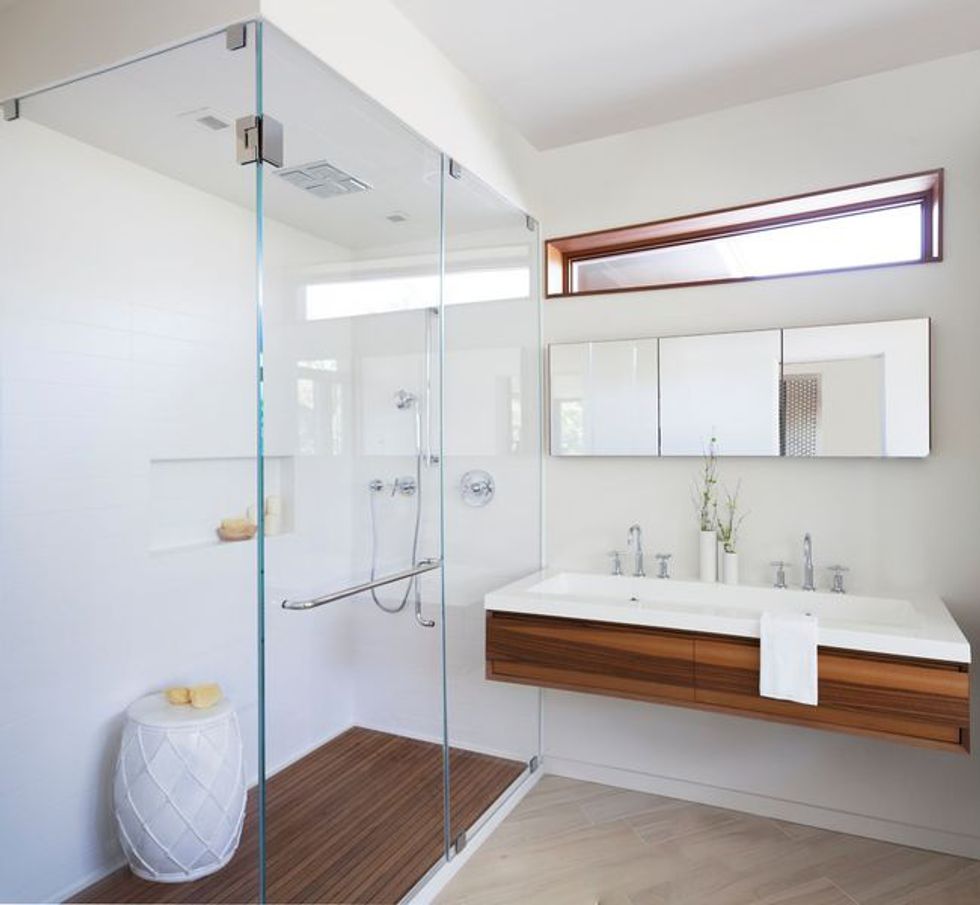
The bathroom also offers a generous walk-in shower with teak platform insert that continues the natural wood theme. Horizontals play a big role as well, beginning with the shower walls, which are stacked with white 16-by-3-inch tiles. The vanity wall is punctuated by a series of horizontal planes: the porcelain-topped double-sink vanity, matched-grain American maple drawers, triptych of medicine cabinet mirrors and fixed transom.
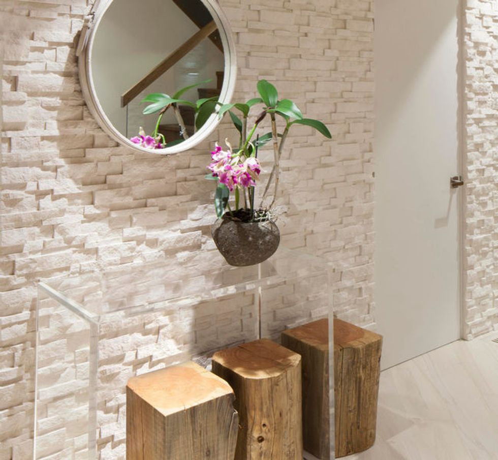
The entry foyer, with natural wood stools, Lucite console and white leather-bound mirror against a white limestone stacked-stone wall, sets the tone for what's to come. "There's nothing stronger against a stone wall and wood than a man-made clean material like Lucite," Carlson says.
This article was written by Carol Crotta for Houzz.
You might also like:
Set the Ambience With Pretty Pendant Lighting


