At some point, we've all felt the anxiety brought on by too much stuff— the clutter in your closet or the cramped furniture arrangement in your studio-sized apartment. Excess is a real struggle.
Which is why we subscribe to the philosophy of Cuyana—the brand that offers elegant, streamlined basics for the modern woman touts the ethos of "fewer, better things."
The thought behind the pared-down statement isn't just evidenced in the products, but extends to the cofounders' personal spaces as well. Working with designer Lauren Nelson, founders Shilpa Shah and Karla Gallardo created their own unique spaces that feel calm, personal, and above all, like an extension of the cult-followed, thoughtful brand they've built together.
Take a look.
A Peek at Karla Gallardo's San Francisco Home

(Photography by Erin Kunkel)
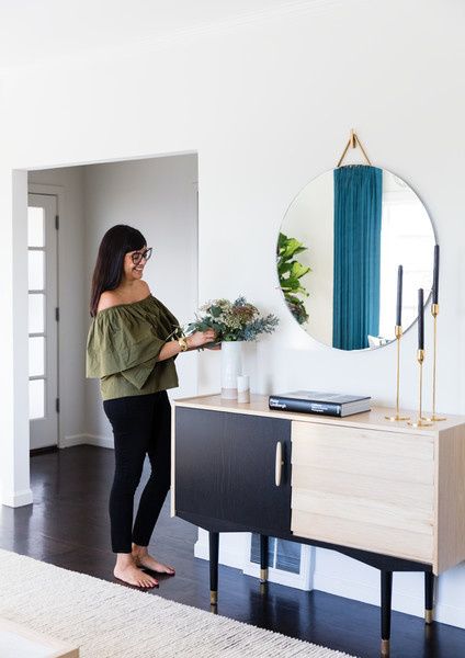
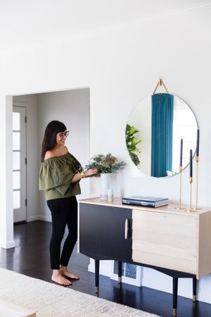
Karla freshens up some florals on her custom credenza by Lauren Nelson Design.
When asked about collaborating with Lauren Nelson on the home, Karla tells Lonny, "Lauren designs through the lens of how to make a space feel comfortable and inviting—while still representing the person."
"We worked together to design the entire space from scratch, with most of the pieces made custom by local artisans. The space was built around a juxtaposition of marble, brass, and light oak for a bright and airy feeling," Karla says.
A Peek at Karla Gallardo's Home

(Photography by Erin Kunkel)
Karla and her husband bought the San Francisco home just after getting married. The three-bedroom home has an open-floor plan, which Karla cites as one of the features she loves about it.
"I love big, light-filled spaces. The home is perfect for gathering with friends and family," she tells Lonny.
A Peek at Karla Gallardo's Home
(Photography by Erin Kunkel)
In Karla's living space, an Egg Collective mirror rests above the custom credenza while a Serena & Lily light fixture and St. Frank textile round out the room's sleek appeal.
▲A Peek at Karla Gallardo's Home
(Photography by Erin Kunkel)
"It marries, clean Scandinavian inspiration with a modern, timeless feel," Karla explains in reference to the home.
"The design elements aren't too trendy, but embodies a timeless aesthetic to see us through year through year."
A Peek at Karla Gallardo's Home
(Photography by Erin Kunkel)
"Warm, minimalist, functional." That's how Karla describes her home and we'd have to agree. The towering candlesticks from March add a touch of glam.
▲A Peek at Karla Gallardo's Home
(Photography by Erin Kunkel)
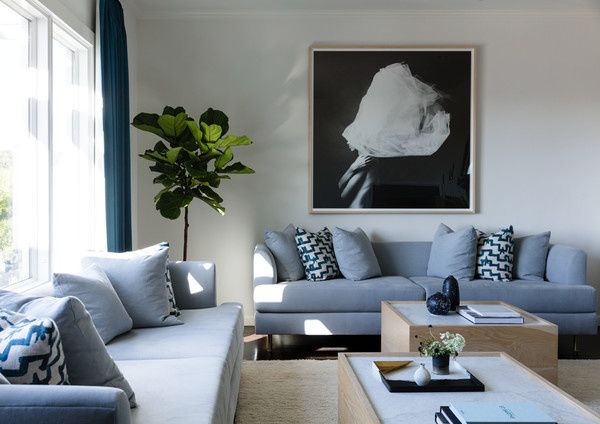
The living room strikes an effortless balance between functional and design-driven. The couch is a custom piece by Lauren Nelson Designs and is anchored by a striking black and white photograph from Curate Art Group and is topped with pillows by Zak+Fox.
The coffee tables are also custom pieces by Lauren Nelson Designs.
A Peek at Karla Gallardo's Home
(Photography by Erin Kunkel)
Karla's bedroom is a calming oasis with two Workstead sconces flanking the Parachute-covered bed.
▲A Peek at Karla Gallardo's Home
(Photography by Erin Kunkel)
Eventide Collective artwork hangs above the bed. While ebony-colored vases top the Design Within Reach side tables.
When asked about her decorating approach Karla tells Lonny, "My personal approach to interior design is the same philosophy that Cuyana was founded on — surrounding myself with fewer but better things that have meaning."
▲A Peek at Karla Gallardo's Home
(Photography by Erin Kunkel)
The nursery, where Karla's son spends his time, highlights an Oeuf dressed and crib (with an Hermes throw tossed over it).
▲A Peek at Karla Gallardo's Home
(Photography by Erin Kunkel)
To add some balance to her busy work and family life, Karla makes sure everything has a distinct place.
"I need a home that is designed to work with my busy schedule so that I never have to second guess anything," she tells Lonny. "I depend on functional details and a curated aesthetic."
A Peek at Karla Gallardo's Home
(Photography by Erin Kunkel)
Wee Wild Ones artwork hangs above the Oeuf dresser.
▲A Peek at Karla Gallardo's Home
(Photography by Erin Kunkel)
Karla's kitchen is a vision in blue and one of her favorite spaces in the home. She states that soul of the home may be the kitchen, but she really loves the entire space for hosting friends and family.
"Our entire home is designed for hosting which is why there is a lot of table space everywhere—there's nothing that gives us more joy then having friends and family over for food and good wine."
"I love to gather around the island in the kitchen over a bottle of wine with dear friends," Karla tells Lonny.
We could easily see why—with stand-out pieces like bar stools from the Danish Design Store and hanging beads from Hudson Grace the kitchen is pretty breathtaking.
A Peek at Karla Gallardo's Home
(Photography by Erin Kunkel)
The light and airy dining room is grounded by a matte-black accent — a pendant by Innermost Circus.
One of the most striking pieces in the dining room is definitely the royal blue credenza custom designed by Lauren Nelson Designs.
A piece by Aquabumps hovers above, which is counted as one of Karla's favorite pieces in her home. "It's the first piece my husband and I invested in after we got married," she says.
"It's artwork that we fell in love with during a trip to Australia at Aquabumps — a photography studio that celebrates early-morning beach life. It's calming light blue and turquoise tones became the centerpiece around which we built the rest of the main space."
Inside Shilpa Shah's Oakland Home
(Photography by Erin Kunkel)
Cuyana co-founder Shilpa Shah in her breakfast nook, which was also designed by Lauren Nelson. When asked about working with Lauren on parts of her home, she tells Lonny, "Lauren is a true collaborator and has the amazing ability to find locally sourced pieces that look and feel like you."
▲Inside Shilpa Shah's Home
(Photography by Erin Kunkel)
The pretty little breakfast nook in Shilpa's Oakland home looks peaceful and inviting with a table from MDF Italia, chairs from Target, and a ficus tree she inherited.
When asked about the story behind the tree, Shilpa tells us, "I had the good fortune of taking care of our family dog, Hidey, at the end of her life."
"I was able to give her the same love and attention in her old age as she was able to give me in my youth. I was heartbroken when she died. So we planted the ficus tree in honor of her memory. It's been growing and blessing us for 12 years."
Inside Shilpa Shah's Home
(Photography by Erin Kunkel)
Lauren Nelson worked on the dining room of Shilpa's five-bedroom Oakland home. The dramatic details like the Allied Maker fixtures and matte-black fireplace add a moody touch.
▲Inside Shilpa Shah's Home
(Photography by Erin Kunkel)
Another stand-out custom Lauren Nelson piece — this one-of-a-kind shelving unit-slash-bar provides a stylish place for Shilpa and her family to gather and entertain.
"Our dining room has a large table for hosting and a cozy fireplace. I love the evenings we spend in there having dinner parties with dear friends and great food," she tells Lonny.
Inside Shilpa Shah's Home
(Photography by Erin Kunkel)
Shilpa getting some work done at her palatial table from Design Within Reach — the sleek chairs are from &Tradition.
▲Inside Shilpa Shah's Home
(Photography by Erin Kunkel)
"When we bought the house, the flow of the house wasn't quite right," Shilpa tells us. "We reconsidered each room with our own spin to ensure that every space is utilized and has purpose."
"The dining room became the office; the living room became the dining room — we have the luxury of space to rethink the way we want to use each room."
Inside Shilpa Shah's Home
(Photography by Erin Kunkel)
The media room is one of the spaces Shilpa envisions changing — eventually turning it into a kitchen space.
▲Inside Shilpa Shah's Home
(Photography by Erin Kunkel)
Shilpa's bedroom features framed photos of past photos from Cereal magazine.
▲Inside Shilpa Shah's Home
(Photography by Erin Kunkel)
When asked about the intention of her home decor, Shilpa tells us, "As a business owner and mother of two, life is very fast-paced. Everything in our home is intended to feel purposeful and peaceful, with dark teal-grays that are very calming as a base for the color palette — it feels like a place of respite."
▲This article was written by Angela Tafoya and styled by Leah Harmatz by Lonny. Click over for the complete slideshow and more stylish home and design stories.
- The Style Council: 8 Bay Area women (and one dude!) changing ... ›
- Inside the Revived SF Oasis of Lonny Editorial Director Angela Tafoya ›
- Cuyana's Fillmore Street store lets you try luxe leather bags before you buy + SF more style scoop - 7x7 Bay Area ›

