At least it doesn't look like a body part...
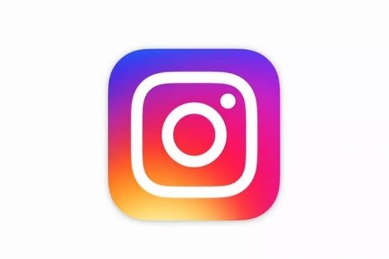
If, like pretty much everyone we know, you opened your eyes this morning and immediately checked your social media feeds, then you may have noticed a brand new colorful app on your phone. That purple-pink-and-orange mess is Instagram's new logo.
"The Instagram logo and design was beginning to feel, well… not reflective of the community, and frankly we thought we could make it better," wrote Ian Spalter, Instagram's head of design, in a blog post on Medium.
Inspired by the previous app, the new icon shows a simpler camera and repurposes the original rainbow into a gradient form. The same look applies to its Hyperlapse, Boomerang, and Layout apps. Inside the app, there are small design changes such as a white top bar and black selected icons instead of blue.
But no matter how many videos Instagram makes to try and justify the change, folks aren't too happy about the modern design. AdWeek even called it"the biggest design fail of the year."
We guess Instagram didn't learn from the mistakes of Airbnb. Tell us what you think on Facebook.
Related Articles
