Architect Stephen Sutro of Sutro Architects grew up in San Francisco just four blocks from this home, alongside one of the owners, who was a childhood friend. Years later, when the friend and her husband hired Sutro for this project, that long relationship made it easy to communicate and share ideas for the transformation of the couple's Edwardian flat from a dark warren of small rooms to a light-filled family dwelling.
Houzz at a Glance
Who lives here: A couple and their two children
Location: San Francisco
Size: 2,900 square feet; 3 bedrooms, 3½ bathrooms
Year renovated: 2013
(Aaron Leitz, original photo on Houzz)
"The modern interventions create an interesting juxtaposition and a pleasant tension between the old and new," says Sutro. The design of a fireplace in Tom Ford's New York City flagship store inspired the architect to create this wood and limestone surround and mantel in the living room.
Sofa: Dizani; art: Matt Lipps
▲(Aaron Leitz, original photo on Houzz)
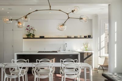
The architect reordered the rooms, making a large, open space up front and relocating the bedrooms in the rear of the house. Now the living room, dining room and kitchen are in one space.
Light fixture: Lindsey Adelman; dining table: Link by Jakob Wagner, B&B Italia; dining chairs: Masters by Philippe Starck, Kartell
▲(Aaron Leitz, original photo on Houzz)
To hide the work areas from the entertaining spaces, Sutro eliminated above-counter cabinetry and placed some appliances behind sleek white panels. "We didn't want it to feel too heavy," he says. "We wanted it to quietly recede."
▲(Aaron Leitz, original photo on Houzz)
"The powder room is where people feel the most aesthetically free," Sutro says. In this powder room he continued his balancing act with starkly modern fixtures and a traditional wood floor.
Sink faucet: Boffi
▲(Aaron Leitz, original photo on Houzz)
The glass makes the room feel far more open and connected to the adjacent spaces.
(Aaron Leitz, original photo on Houzz)
A trough sink allows two people to use it comfortably.
▲"We call this project Parisian Modern Flat, because it uses the European idea of classic architecture as the backdrop for modern elements and furniture," says Sutro.
The architect staged a delicate design balance. "By using classic molding and a herringbone-patterned floor, we referenced the era in which the house was built," the architect says. A sofa with multisided seating has decidedly modernist attributes; it allows people to relax and enjoy the contemporary fireplace, the avant-garde photo collage, the more traditional bay window or the modern kitchen. "It is the perfect piece, because it has seating on all four sides," says the architect. "It knits the room together."
"The Lindsey Adelman light fixture defines the dining area and adds a formality to it," says Sutro. Although the architect removed the division between the rooms, he left a suggestion of a wall between the dining room and kitchen to make a slight visual separation. "It's just enough to suggest two spaces," he says. "Dim the lights in the kitchen during a dinner party, and it seems to disappear."
"Before the remodel the kitchen was tucked at the back, the darker area of the house," says Sutro. When he moved the kitchen to the center, he reassigned its former place to the study. To lighten up both the study and the stairwell, he replaced a wall between them with slightly opaque glass.
An opaque glass window also appears in the master bathroom, allowing privacy in the tub but letting light fill the room. A trough sink allows two people to use it comfortably. "The vanity is only 5½ feet long," Sutro says. "Two sinks didn't make sense here, but a trough makes the vanity feel longer and more usable."
From public spaces to private, the home's entire interior design is a balancing act well executed.
// This story was written by Mary Jo Bowling, and originally published on Houzz.
Stunning Two-Tone Fireplace Mantels
