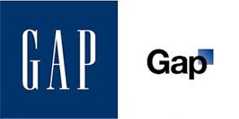
For reasons unbeknownst to us and the rest of the blogosphere, Gap decided to ditch their iconic logo for something a bit more...modern.
And by that, we mean they wrote their name in Helvetica and slapped a blue gradient box on the righthand corner.
Don't get us wrong, we love Gap and a silly logo won't change that, we just want to know why? An effort to revamp their look to improve sales? An attempt to take in American Apparel's fleeting customers?
What do you all think about the redesign?
Related Articles
