When perusing other people's homes comes with the job description, you quickly learn how to "narrow in" on what it is you like and dislike, while simultaneously steering clear of fleeting trends while simultaneously identifying what makes a space feel personal. It's a rather convenient skillset when it comes time to take on your own mammoth design project.
For Lonny's editorial director Angela Tafoya and her husband, artist and designer Eric Bailey, inheriting a grand old dame that had been in Eric's family since the '60s did not come without its own set of challenges. Bailey's family grew up in a gorgeous early 19th century build situated about a block away from San Francisco's Golden Gate Park. Expansive, yet in need of a little face-lift, the multi-story home in the Inner Sunset pined for a new lease of life."
I could see the memories that had been made, despite the state it was in," Tafoya says, upon meeting the renovation project and soon-to-be family home, for the first time. "I think what the home really craved was some major TLC and to be transformed but still have key elements preserved and ultimately a place for family."
Restoring a home that's fundamentally old school, from bare bones to the layout and everything in between—think toilet and bathroom behind separate doors and a fireplace room clad in weathered, out-of-date interiors—is a task many would opt out of. Adding to this, the bustle that is raising a now three-year-old daughter, Tallie, the painstaking fixer-upper was by no means considered lightly.
"The biggest obstacles were renovating on a budget and time," Tafoya explains, when unpacking the project.
"My husband worked as the main contractor, taking time out from his regular gig, along with a family member who does it professionally, but time was limited to nights and weekends, which made the project lengthier than one might expect. We also moved in when the home was partially done. It definitely was foreign navigating that with a toddler. We had to really think about how to make it workable within our limit—so doing a total gut job just wasn't an option. I actually liked that we didn't gut the entire thing, but did small tweaks to just modernize it a bit but still kept the essence of the home. There are still elements like stained glass in the windows or this lever that opens the front door from the top of the stairs that I find special and unique to the space."
While farewelling their home in the Mission and sailing off into Inner Sunset bliss came with kinks, the result is a crisp, contemporary, and refreshingly playful renovation that speaks for itself.
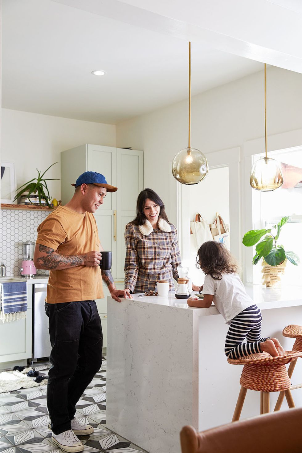
"We designed the space ourselves and wanted to be considerate of the history, but also wanted make it feel full of personality and much more modern," Tafoya says. "We really applied our own design sensibility and penchant for color, art, and texture. And, we remembered to stay patient—these projects take time—keeping in mind the ways people approach spaces these days, which is with a sense of openness."
With the ability to now glide from light and airy room to room with ease, it's clear the couple achieved their objectives.
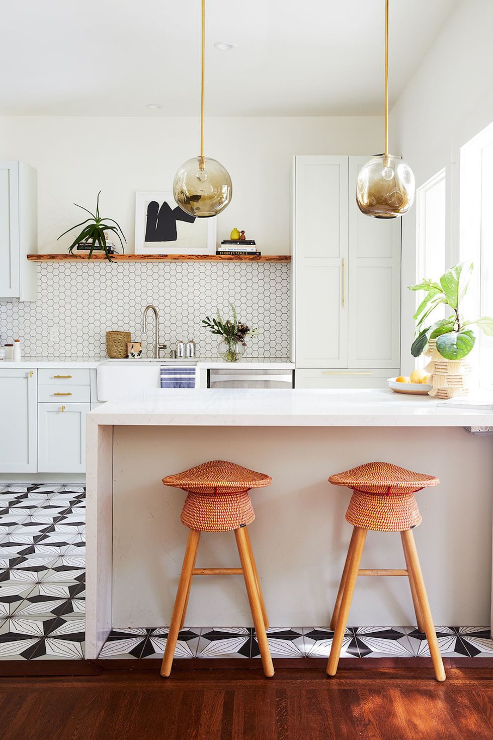
Upon entry, you're seamlessly lead up stairs and into the common space, a modern and revived family-style kitchen, fitted floor-to-ceiling with opposing grey-green cabinetry (by Ikea with Semihandmade fronts, painted Cromarty by Farrow & Ball, are serious DIY goals). The bones of the cabinetry came from Ikea but the family added fronts from Semihandmade (shaker style)—which they assembled and painted themselves, proving to be a much easier DIY than they anticipated.
A grassy green backyard (which Bailey also revitalized into a workable oasis) runs off the playroom (which is to the right of the kitchen)—all but essential with a little one and not one, but two dogs in tow.
The kitchen's center island is crisp and contemporary, while the geometric Fireclay Tile evokes a Mediterranean look and feel. The space is bound together with a tiled splash back and peppered with earthly accents and cozy rust colored coiled bar stools (by Umbra) while smoky statement pendant lights by High Fashion Home hang overhead.
Despite a fresh lick of paint and design-savvy fit-out, both Tafoya and Bailey were conscious to create a shared space that could be re-loved and comfortably lived in, rather than preserved.
"I'm totally okay with my dogs sleeping on our furniture or our toddler taping pictures on our credenza," Tafoya laughs. "I think we wanted to create a space that reflected our busy life in a thoughtful yet functional way. Nothing should be too precious." The couple set out to create a space for family, first and foremost, with their efforts perfectly encapsulated in their three-year-old daughter's dedicated spaces.
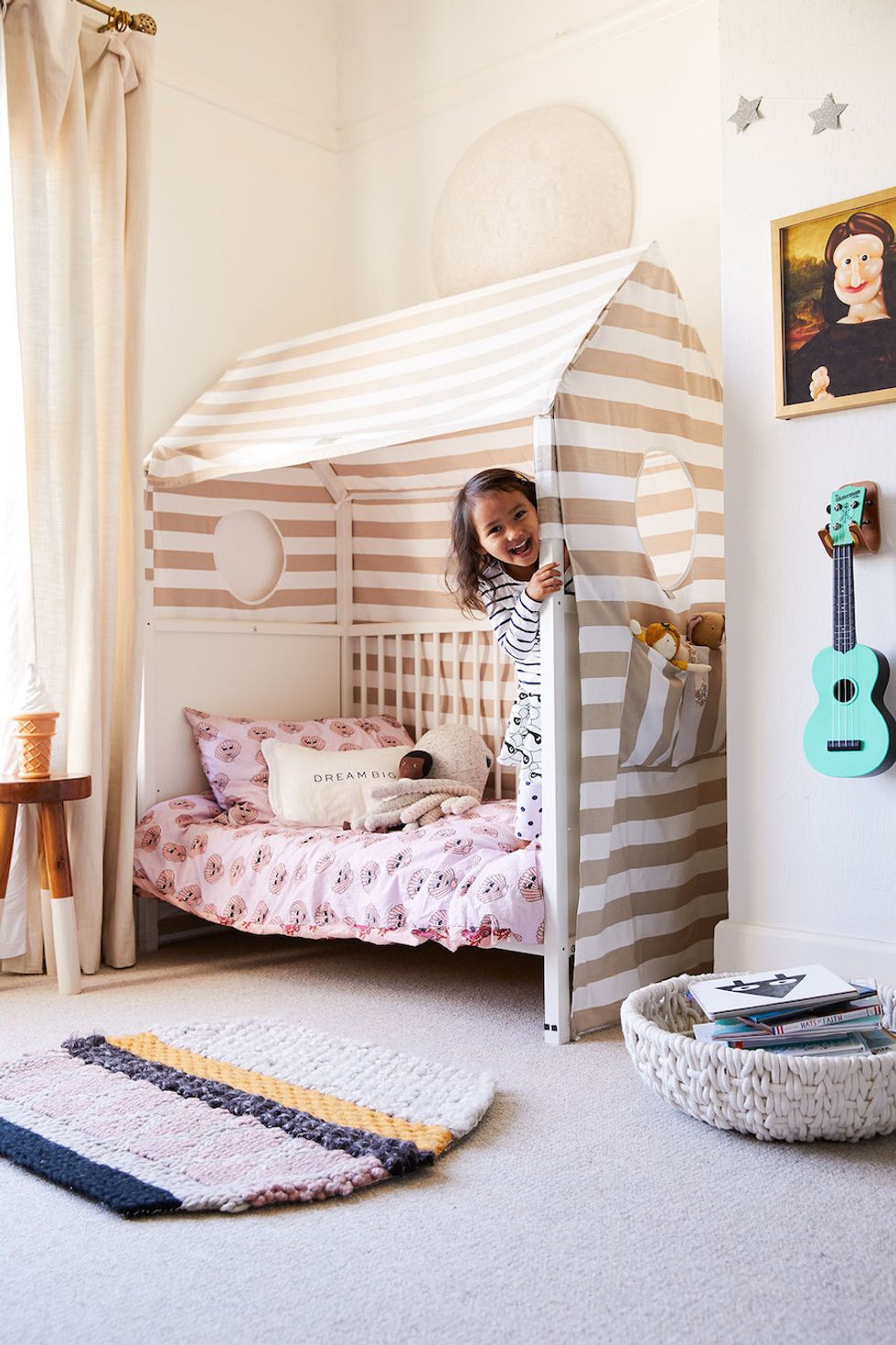
Tallie's bedroom, a childlike oasis that conjures up adventure, is dotted with cute conversational pillows by Hill House Home that read "dream big." Organic drapes by Barn & Willow and caramel colored stripes on a Stokke tent bed complete the overall vibe.
"I looked for items that felt pretty gender-neutral, and really wanted her room to just feel like a child's wonderland—making sure to include pieces that would bring a smile to both of our faces and that we all get enjoyment from."
A dip-dyed side table by Serena & Lily, monstera leaf rug by Lorena Canals, and snuggly blue Multy sofa bed by Ligne Roset provide a comfortable nod to the remainder of the home.
With olive-splashed walls, the newly christened reading room holds pride of place in their new space—"this is one of the quirks of an old house," Tafoya says—reworking what previously housed an out-of-action fireplace.
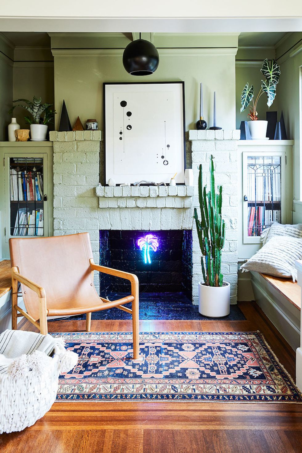
The couple gave new life to the unoccupied nook with a splash of black paint and a playful neon palm by Meryl Pataky embedded within. Gorgeously green walls and minty fresh brick add an organic element to a cleverly utilized, otherwise redundant retreat. Books are neatly stacked behind glass cabinetry, while various living things and modern, monochromatic ceramics dress the mantle.
"This room is a little impractical, especially considering the fireplace doesn't work, but we've morphed it into a nook that is great for reading or run-over seating when we have bigger gatherings."
The paint is French Gray by Farrow & Ball and provides a calming pop off the side of the living room. A simple piece of art by Skye Schuchman (from the Dots and Lines collection) and a Folk x Rejuvenation Pendant hovers overhead.
"It's a random little nook that also feels a little crazy, but I love that." Complete with a buttery soft leather sitting chair by Melbourne-based design studio Barnaby Lane (reoccurring in various forms throughout the family's dining space) and an area rug by ABC Carpet & Home, it's hard not to grab a book and settle in for the afternoon.
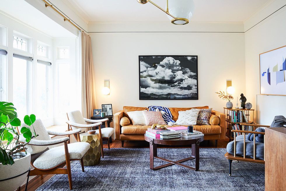
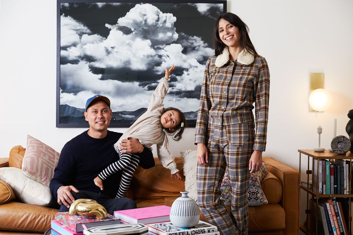
Each of the cozy yet contemporary living spaces speak to the family's signature style and laid-back approach. A tan, leather-clad sofa by Article anchors the living room along with natural-colored drapery by The Shade Store, while a dreamy print of rolling clouds (sourced via Minted) completes the picture.
Peppered throughout the house are uniquely different works of art, each as significant and statement-making as the next.
"Every time I go up the stairs and look at our St. Frank textile, I smile. It really is one of my favorite pieces I've ever owned. A lot of the art actually is my favorite—I also love our Meghan Shimek piece on the landing and our Block Shop Textiles print in the dining room."
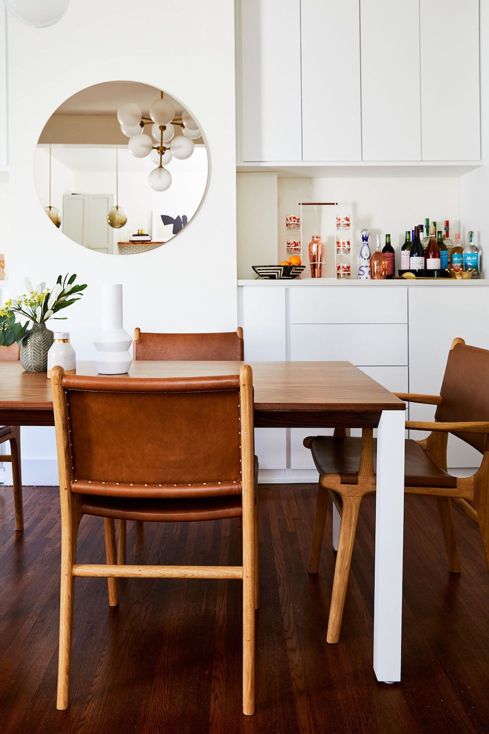
When asked if she had to pick a favorite furnishing, though, Tafoya admits the Barnaby Lane dining chairs dotted around their simple yet chic Interior Define table are a standout.
Upstairs, the master bedroom provides a similarly calming retreat from the daily grind. "I have always been attracted to pattern and color—a minimalist I am not," Tafoya admits. "I've realized that's okay. I draw inspiration from so many places, from walking around my neighborhood to travels, but just generally thinking about how I want to feel when I'm at home really helped me shape the style of the space. I want to walk in and feel a vibrancy—an artful touch with coziness throughout."
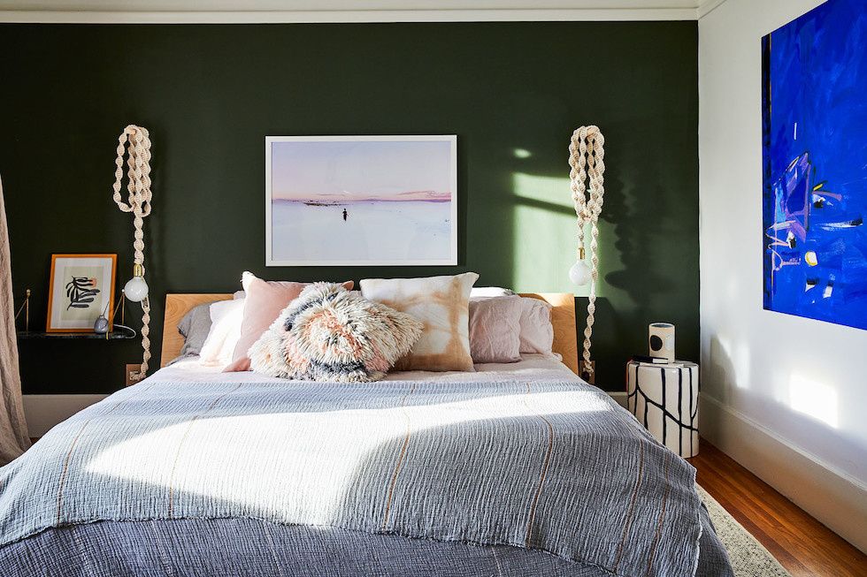
An electrifying blue, painterly oil on canvas by Bailey hangs adjacent to the couple's bed, while a deeper hue of green—Vogue Green by Sherwin Williams—gives the space depth and an element of richness. Convenient bedside outlets receive a subtle pop with brushed brass wall plates by Legrand.
An assortment of tactile throw cushions by Tabula Rasa, Consort and Rebecca Atwood sit propped, while ornamental macrame lights by Windy Chien, accent both sides of the bed.
It's evident that this is one husband and wife duo who is firmly on the same page when it comes to design, look and feel—a shared passion that's paid off in spades. With one notable exception, Tafoya points out.
"My husband and I are pretty compatible and eye-to-eye most of the time, and really loved the color and light feel of the Semihandmade cabinetry in the kitchen, but I really wanted a super patterned ceramic Fireclay Tile to complement it, which is actually hand-painted in Sausalito."
"We went back and forth on the pattern, because I wanted to make a statement and he thought doing something more subtle would be wise."
"Who do you think won?"
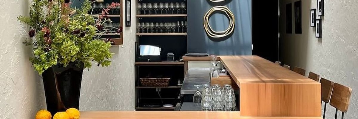
Thankfully, the light and bright California Closets built-in bar remains fully stocked, and conveniently within reach.
"Decision fatigue is a real thing, so just be prepared for that," adds Tafoya. "Do what feels right and ultimately how you envision yourself functioning within your home—the rest will fall into place. And not having a kitchen or having a construction zone for a home are super temporary. Keep that in mind and use that ethos to get you to the finish line."
This article was written by Ashley Ropati for Lonny; click over to see the full slideshow of pics from Angela Tafoya's lovely home.


