Updating a midcentury modern home can be a challenge.
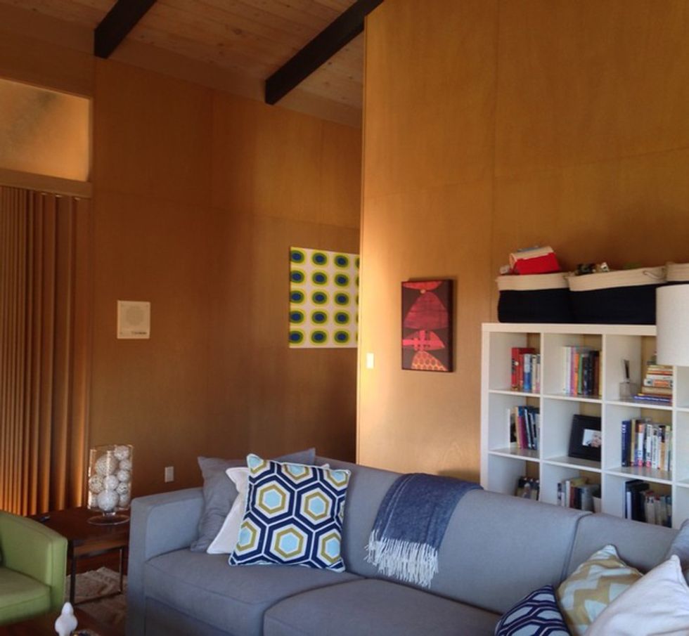
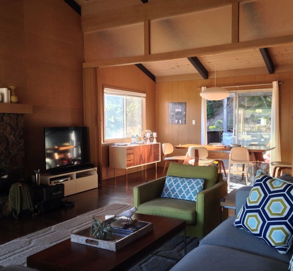
What was new and fresh has probably faded over time. Midcentury design's trademark dark wood paneling and flooring can feel dated 50 years later. The goal for this Greenbrae home, built in 1963, was to replace the drab wood paneling and lighten up the interior while staying true to the era's best features.
Owners Danielle and Paul Nelson enlisted the help of design-build firm Building Lab to brighten the interior and open up the floor plan, while still maintaining a sense of coziness. "They wished to maintain the character of the house and the original architectural elements while modernizing finishes and maximizing efficiency of the space they had," says Hingman Chan of Building Lab.
Houzz at a Glance
Who lives here: Danielle and Paul Nelson and their sons, Thatcher and Xander
Location: Greenbrae, California
Size: 2,195 square feet (204 square meters); four bedrooms and two bathrooms
Architect: Building Lab
(Scott Hargis, original photo on Houzz)
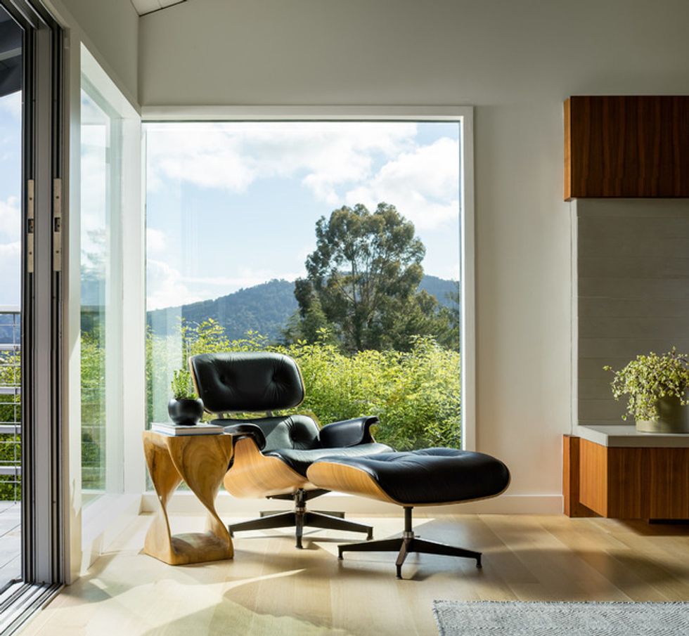
An Eames chair and ottoman anchor one corner of the living room with a view west toward Mount Tamalpais through floor-to-ceiling windows.
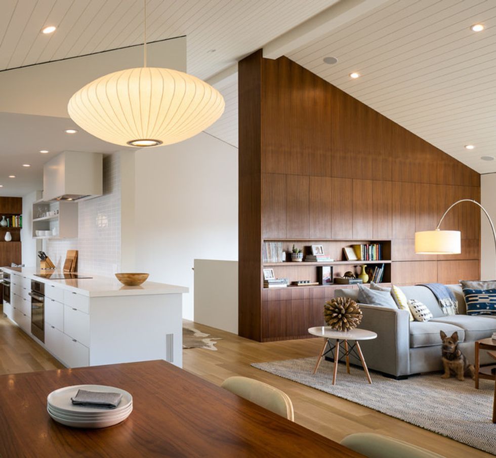
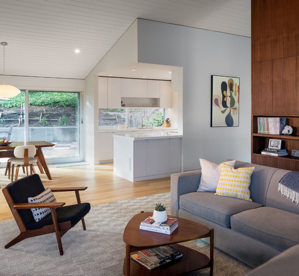
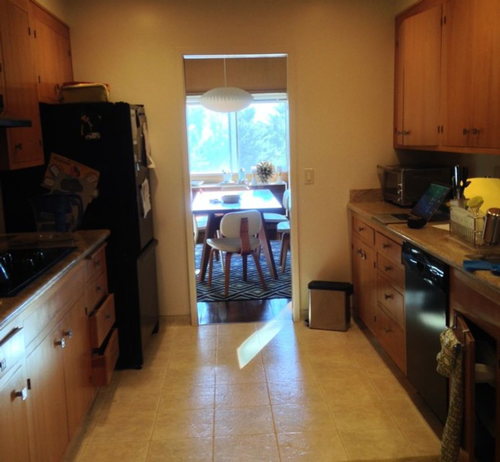
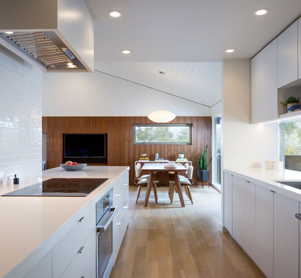
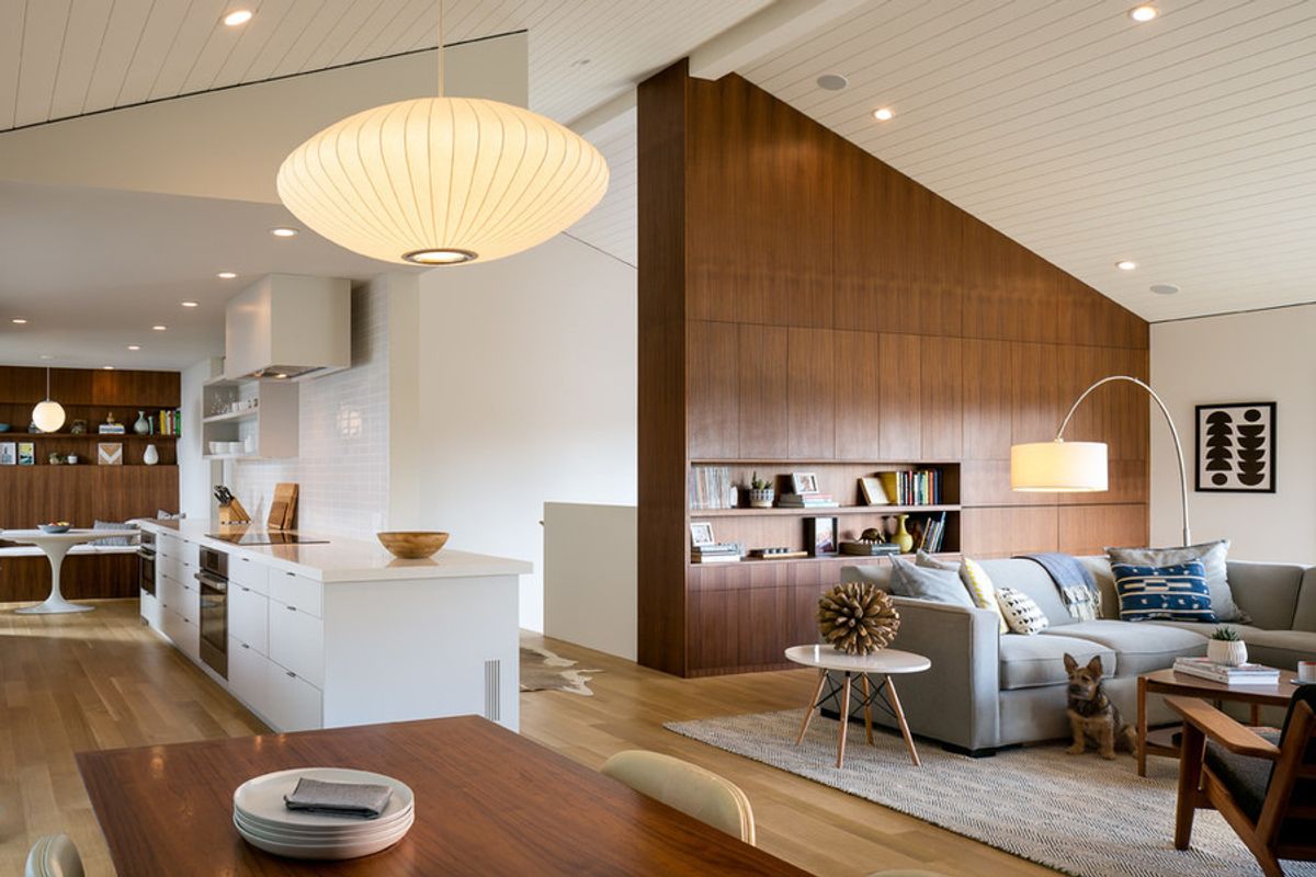
All partition walls in the common areas were removed, resulting in a smooth flow in the newly open living, dining and kitchen space. New walnut panels with built-in shelving were used strategically to maintain the midcentury feel. To open up and connect the kitchen to the living spaces, an area was cut out to expose the kitchen, Chan says.
"The cutout of the corner with the top being hung from the ceiling structure involved some rather difficult details. Together with the dropped soffit, this hung corner sculpted the shape of the kitchen so that it anchors one corner of the great room," Chan says.
The living room fireplace was updated with a new surround and bench of porcelain tiles by Mosa in a mid-warm gray. The original wall clad with mahogany panels up to the ceiling was removed and the wall rebuilt with walnut panels placed only to the top of the adjacent windows "to emphasize the horizontality and expansiveness" of the space, Chan says.
A sliding glass door opens to the front deck — a connection to the outdoors that is a typical midcentury modern feature. In the opposite corner of the living room, a custom flip-down desk with storage is used as a home office. The original wall was covered in the same mahogany panels that sheathed the walls in the common areas.
Opening up the wall separating the kitchen from the dining room didn't increase space in the kitchen itself, but it improved the transition between the spaces. The homeowners initially didn't like the low horizontal window, which serves as a kind of backsplash, but now "they love it," Chan says, because it allows them to watch their young children playing outside.
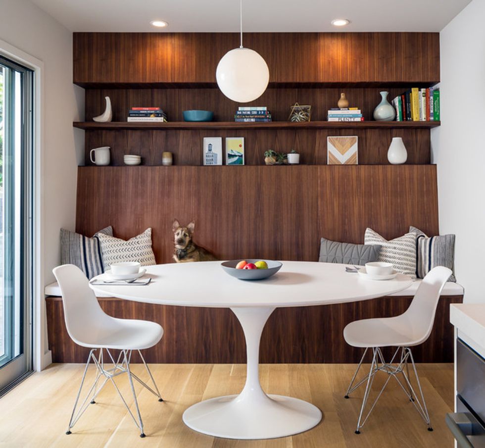
The bench and shelving anchor the space at that end of the kitchen and create depth, Chan says. The nook was created by relocating an existing laundry to the home's lower level. New sliding glass doors open the back of the house to the patio, allowing natural light in.
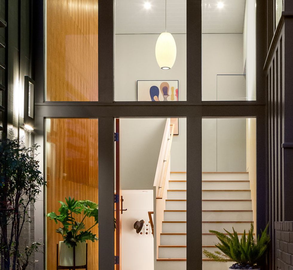
The stairs, half walls and handrails are all new. The new stairs are wider than the old ones, "to establish a hierarchy," Chan says. The door frame was kept, and all glass and a new entry door were installed. Opposite the new walnut accent wall, the other walls are drywall painted white, leading visitors up and around to the living room.
// This story was written by Julie Sheer, and originally published on Houzz.
More On Midcentury Modern Homes


