After work had sent them around the globe, the owners of this Wine Country house wanted to put down roots. They turned to their vacation house, which had served as a constant during years of relocations.
It was a turn-of-the-20th-century cottage on a piece of land that had been part of a large, long-gone fig and walnut farm. The problem was that the place was fine for a family weekend but not big enough for an extended stay. "I wanted to have things like closets and a decent bathroom for a house I would live in full-time," says one of the owners. "But I was so nervous about changing it—I wanted to be careful to preserve its charm." She hired architect Nick Noyes to help design a house that would respect its past and be ready for the future.
Houzz at a Glance
Location: Northern California Wine Country
Architect: Nick Noyes
Size: 4,500 square feet (418 square meters)
"Houses are like people. Inherent in any structure, there are limits, constrictions and challenges. It is the house holder's job to create magic out of the flaw — to transcend the problem and make something beautiful out of it," says the owner, who professes a weakness for difficult-to-renovate properties. "Our family loved the house before the remodel, but it was funky. It hadn't been touched since it was built — except for some bad touches that happened in the 1970s."
Noyes had a problem-solving plan, the essence of which was simple: Grow the basement and the attic levels and reconfigure the middle floor for better flow and better access to the deep raised porch that hugged the building.
"There was a low-ceilinged basement that was hard to stand up in, and the attic was simply storage space," he says. "We raised the house to make the lowest level usable. It now holds an entry, utilities area and a guest room. The remodeled attic has a taller roofline and six dormers that give it more headroom and make it livable."
These are big changes that have made a big impact, but that doesn't mean the old house is gone. Code restrictions said that the porch railing had to be higher and tighter, but the design is a version of what was there. The brackets on top of the columns were simply removed from the old house and reinstalled on the colonnade. What's new in the design is a little Big Easy flavor.
"My husband and I grew up in New Orleans," says the owner. "We were inspired by the raised cottages we remembered from childhood."
The inspiration from that life experience mixed with the simple lines of the old farmhouse to create something unique. "The new house is like a memory of what was there — and of classic Southern architecture and country homes," Noyes says.
If you say "classic Southern architecture," many people picture Tara from Gone With the Wind, but that's not what the owners wanted. Their desire was for a more humble country house, and that's what led Noyes to select elements like a prerusted corrugated roof. "It gives the house the informality the owners wanted," he says.
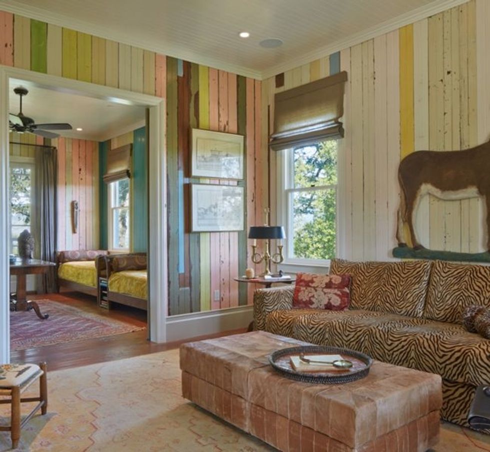
But it's not just the aesthetic of the former house that was preserved; many of the building materials were reused in the new design — including beadboard panels, which were reinstalled in a dramatic way.
"When we bought the house, the rooms were painted these crazy colors, but we never repainted them," says the owner. "During the remodel, because we were installing new wiring and plumbing, the contractors had to remove all the boards. They were stacked in the yard, and I was very inspired by them and the mixing of the colors. The idea was that they would be reinstalled and repainted, but when I saw the boards go up at random, I thought, 'Oh, my God! I love these!' I decided I wasn't going to do it." She let the contractors continue to install them in the totally random pattern that's on display today (seen here in the media room).
It's a decision the architect took in stride. "My client has excellent taste," Noyes says. "She brings interesting ideas to the table — and she has a way of putting things together that shouldn't work but do."
Some of those ideas are expressed in her furniture and accessory choices. The donkey is from a classic outdoor Nativity set and was discovered at an antiques store. ("I am the consummate flea market shopper," says the owner.) The custom sofa is covered in a more exotic equine print (zebra stripes). A low wooden chair is just one of many scattered throughout the house. "I have a chair issue," the owner allows. "I love chairs with personality."
"I come from a long line of strong females," says the owner. "I've benefitted my whole life from their homemaking abilities and their strong artistic sense." She says that training has allowed her to make every house her family has lived in a home — no matter where it was located on the globe. It also set her on the path for a personal design career.
"My client grew up with a lot of traditions, and she has a house full of great Southern antiques," Noyes says. "Those are just some of the reasons I think of this house as a house about memories."
In the kitchen the old boards are met by some of the original kitchen cabinets. "They were in good shape, so we used them," Noyes says. They are topped with a soapstone counter, which is period appropriate.
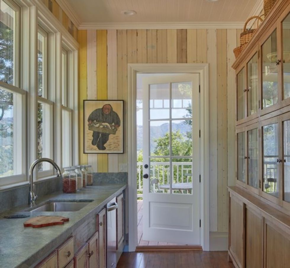
The storage across from the sink is a vintage piece. "It's a beautiful freestanding piece she found," says Noyes. "It's the kind of thing that would have been in an old grocery store, and it's perfect for holding foodstuffs and plates in this kitchen."
In the living room and dining room, the walls are clad in a soft sage green the owner had custom mixed. The reason is both practical (they ran out of the recycled boards) and aesthetic. "It was just too intense for every room. I felt that you needed a break from it," the owner says of the striped look.
The star of the living room is a hot-pink sofa. "I almost didn't do the sofa. It was getting toward the end of the project, and I was wimping out. But my good friend encouraged me to go for it, and I thought, 'I'm 60 years old. This is what I want to do, and I'm going to do it,'" says the homeowner. "At first my husband was horrified, but he really likes it now."
That sentiment is shared by the architect. "Anyone who knows me would not think I'd love a hot-pink sofa," Noyes says. "But the truth is I have a crush on that couch. It's a phenomenal piece of furniture."
The adjacent dining room shares the living room's muted hue. It's the backdrop for the owner's mother's dining table and chairs (12 similar but mismatched seats — apparently chair issues run in the family) and a curvy chandelier the owner found in a friend's garage and purchased.
The appeal of the raised porch is clear. "I love the elevated porch, because you feel like you are in the trees," says the owner. "It's pleasant to sit there and look out and a wonderful place to eat a meal. We have what we call 'porch talk,' and our motto is that what is said on the porch stays on the porch."
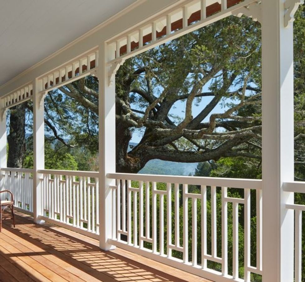
The reworked porch railing is an elaborate frame for the old oak trees that surround the site. The trees spoke to the owners when they bought the property 20 years ago, as they reminded them of New Orleans.
"In the very hot summer, the porch provides shade for the interior," says Noyes. "In the winter, when the sun is lower, it comes through the windows and warms the house."
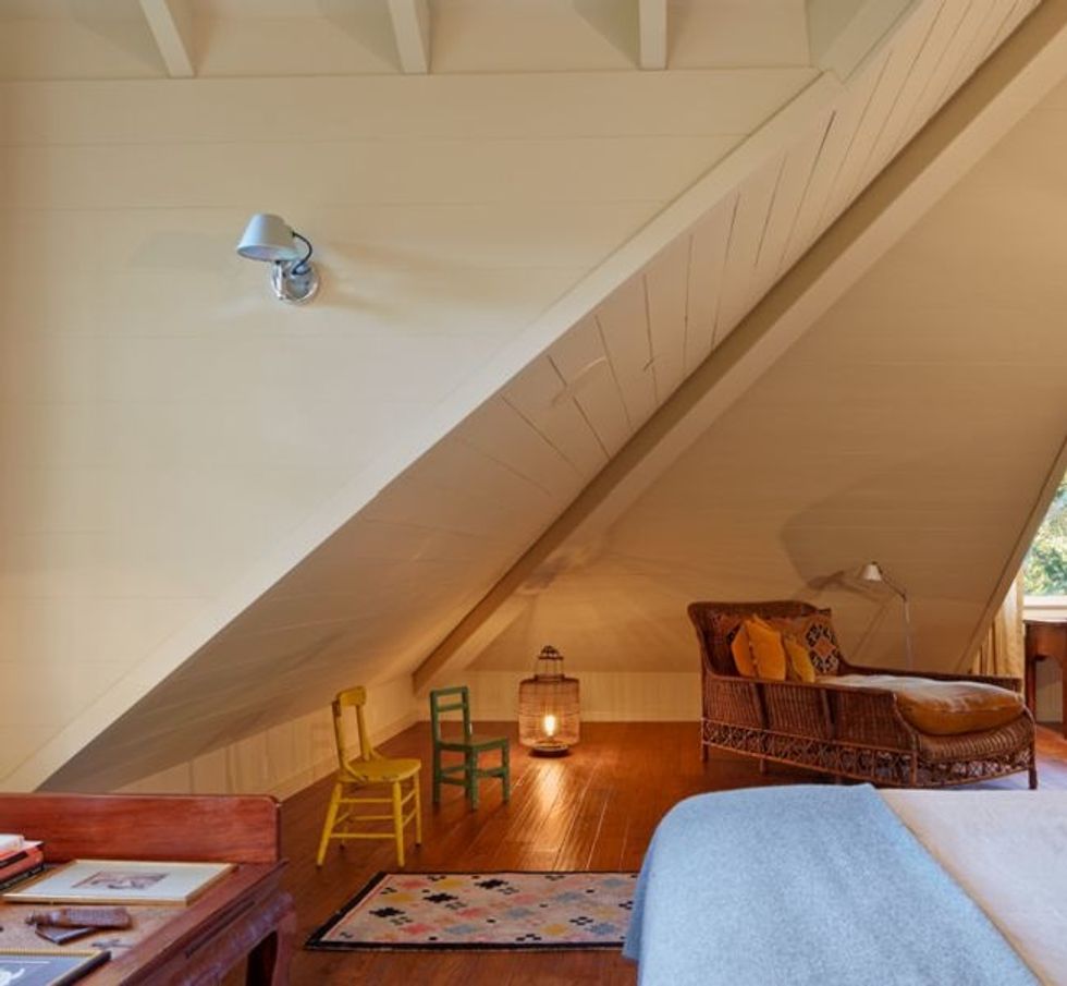
Before the remodel the house lacked a proper master suite. "After a lot of discussion, we decided to use the attic level for the master bedroom and bathroom," says Noyes. "Much of the room has a steeply sloping ceiling, making it impossible to stand up. We added the six dormers to deal with that situation."
It was a pleasing condition for the owner, who has always loved all-but-forgotten nooks and crannies. "I love spaces like allies or attics — to me they are the secret places you used to dream about in childhood," she says. "I also love dormers and sloping roofs."
The detailing of the dormers on the interior was important as the exterior treatment. "We let the wood boards express themselves, which makes them at home here," says Noyes. "They have become part of the character in this old house."
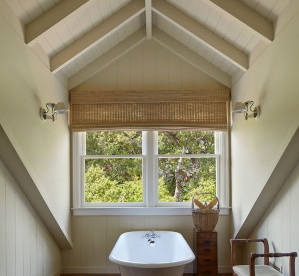
That character is expressed in the master bath, where a dormer surrounds a traditional claw-foot tub. The bathtub is angled to take in the leafy vista.
It's those connections to the outdoors that make this house as California as it is Louisiana. In the back of the house, a stairway is built into the porch, allowing easy access to the garden after porch-talk sessions have ended.
"When we decided to remodel our funny old farm house, we set ourselves up for many limits — the way it was laid out, the style, the materials etc. By working with it and coaxing out the charm, we got something unique. I could not have made up this house from scratch. It is truly organic in that it evolved out of its own bones and life," says the owner. "I think we have given it a new lease on life that will last into its next century."


