Stephen Shoup entered architecture school as a devotee of Craftsman style, but when he left Cal, he had evolved into a modernist.
Shoup went on to found building Lab, a design-build company, and after working on a few homes by Joseph Eichler, he became a fan of the modern houses created for the midcentury masses. When he and his wife went looking for a family home, they quickly narrowed in on the Eichler development known as Marinwood in San Rafael. There they found a house in the coveted style and made it their own.
Houzz at a Glance
Who lives here: Stephen and Taya Shoup, daughter Hannah and dog Stella
Location: San Rafael, California
Size: 1,550 square feet; 2 bedrooms, 2 bathrooms
Year built: 1956; remodeled in 2013
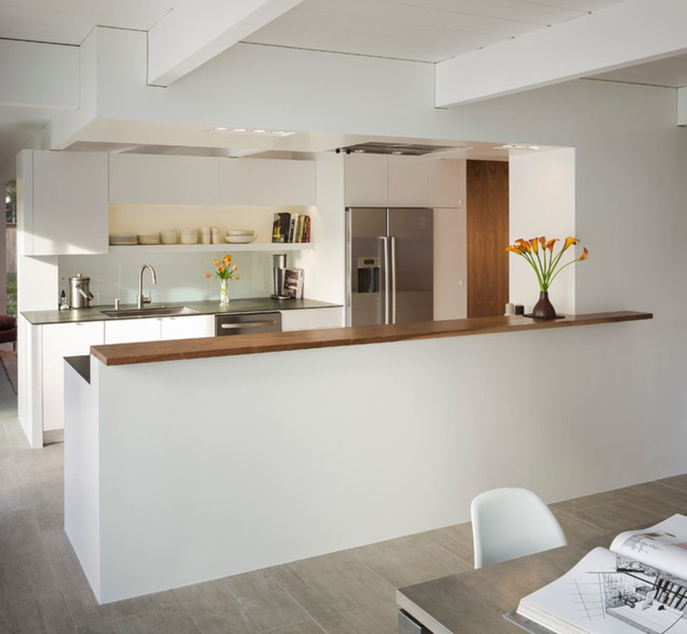
The kitchen backsplash is made of white laminated glass. "I wanted to share light between the rooms," Stephen says. "The fact that the wall doesn't meet the ceiling and the backsplash is glass makes the rooms separate but not cut off from one another."
Countertop: Richlite; floor tile: Provenza Reuse in Fango Sand
(Scott Hargis, original photo on Houzz)
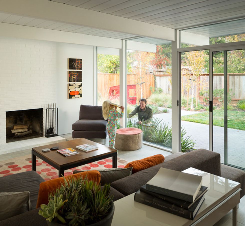
Stephen, seen here with daughter Hannah, says that many people respond to the Eichlers with joy. "I think the style engenders a sense of freedom and felicity," he says. "We have a lot of kids over, and many of them leave saying, 'I love this house — it's a blast.'"
(Scott Hargis, original photo on Houzz)
All Eichlers were designed with radiant heat, and luckily for the Shoup family, their system was still working.
(Scott Hargis, original photo on Houzz)
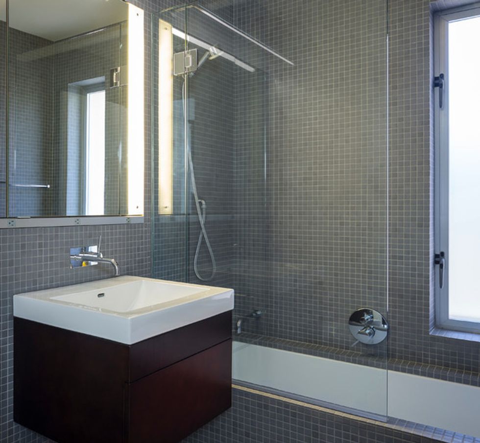
As every parent knows, a tub is imperative.
Sink, vanity: Ronbow; sink faucet: Cifial; shower and tub fixtures: Hansgrohe; tile: Daltile in Suede Grey
(Scott Hargis, original photo on Houzz)
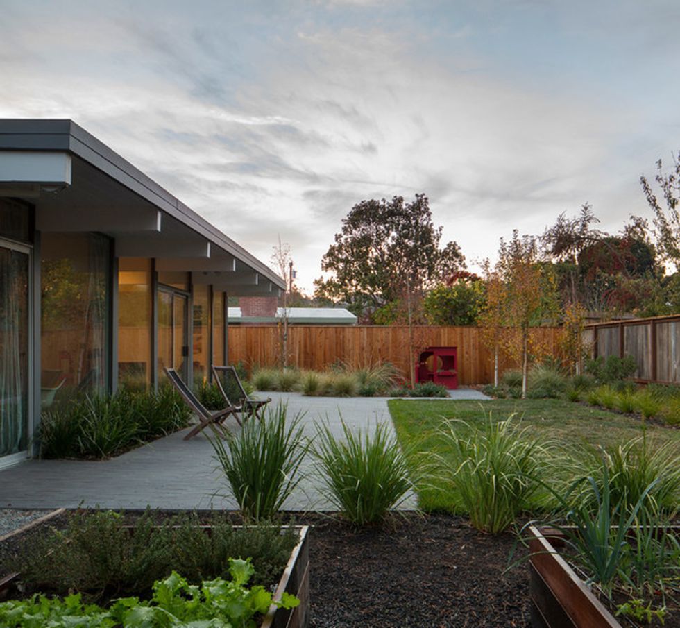
The couple retained the original concrete patio. The concrete-like tile runs into it, blurring the lines between indoors and out.
(Scott Hargis, original photo on Houzz)
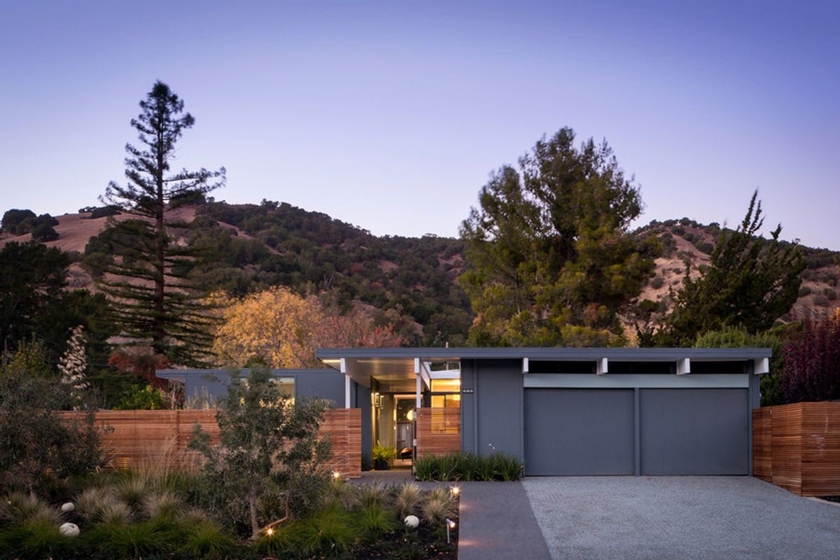
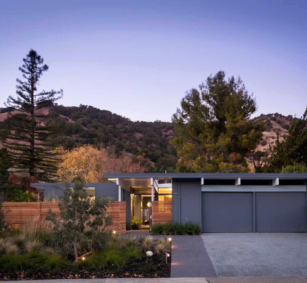
"Most Eichlers have vertical slat siding," he says. "We experimented with the fence by taking the same-size slats and turning them on their side, and we think it works great."
Exterior paint: Rocky Coast, Benjamin Moore
(Scott Hargis, original photo on Houzz)
The Shoup family moved into a non-atrium Eichler. Stephen created his own courtyard by installing a fence with horizontal planks in the front yard. Taya, who works at a landscape architecture firm, chose drought-tolerant grasses and olive trees for the front garden.
Stephen left spaces between the slats for a translucent effect. "From the outside Eichlers can be a bit uninviting—often it just looks like all garage from the front," he says. "I wanted to make the exterior more welcoming, so the fence is see-through." The structure means that the family can experience the indoor-outdoor lifestyle Eichlers were designed to champion.
"We leave the front door open, and we wander in and out at will," Stephen says.
At night the light shines through the fence for a lantern effect. "I like the layered look of solid wall, slatted fence and glass," says Stephen.
Like many architecture fans, Eichler connoisseurs tend to fall into two camps: restorationists and remodelers. The purists want to keep the style exactly as it was on the day it was finished. Others love the look but want to update it for today's living. Stephen falls somewhere in the middle.
"I embrace it, but I wanted to evolve it," he says. For example, the exterior color is similar to the original palette Joseph Eichler chose, but not one of the original hues.
Another evolution example: Stephen kept the ceiling beams white. They had been painted that color by the previous owner; the original beams were dark. He wanted the kitchen to be like a monolithic structure in the heart of the house, so he designed it as a seamless mass of drywall and MDF. "I wanted it to read as a block that had been carved out to form a kitchen," he says. The architect widened the space between the counters from 42 inches to 50 so the entire family could gather here at one time.
The designer notes that the small size of the home initially gave his family pause. "But the indoor-outdoor connection makes a huge difference," he says. "It feels much larger than its true square footage."
The walnut paneling that runs through the core of the house pays tribute to the original home. "Eichlers were filled with dark paneling," says Stephen. "This is walnut veneer on plywood, and it defines the main hallway." The rest of the house, save for Hannah's room, is white.
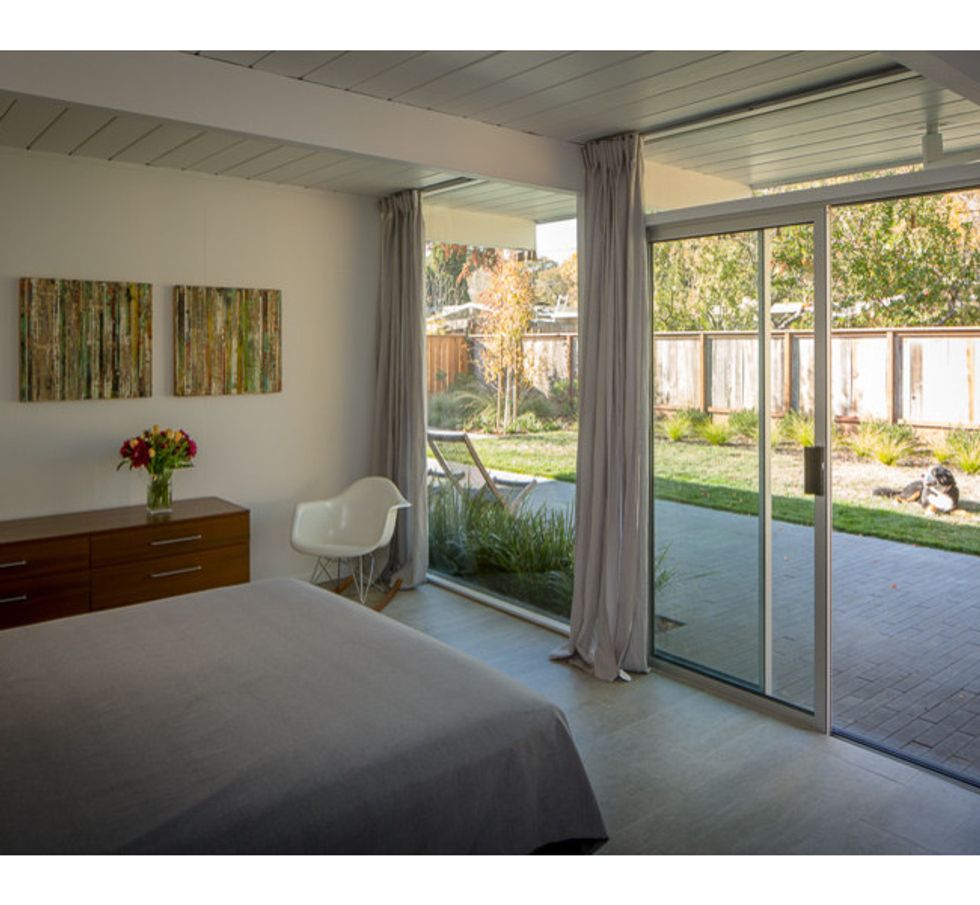
The master bedroom, like most of the rooms in the house, is oriented toward the backyard. "We replaced all the windows and doors with double-paned, insulated models," Stephen says.They used porcelain tile that looks like board-formed concrete throughout the house.
To visually warm up Hannah's room, the couple chose a light blue for the walls and Flor tiles for the floor. "We have had to balance our architectural leanings with what makes sense for a child," Stephen says.
In another child-friendly move, Stephen designed a custom glass shower door that swings inward, toward the showerhead. The bathroom is small, and the couple didn't want to cut it in half with a shower curtain. A wall-hung vanity also makes the room feel more open.
Stephen believes that there's been a renewed interest in Eichlers because modern design has been popular in recent years, but he thinks it will not wane. "I think the Eichler style is iconic enough to survive fads," he says. "It's a timeless look."
// This story was written by Mary Jo Bowling and originally published on Houzz.
You might also like:
Exterior Eye Candy to Nail Your Curb Appeal


