If you've met the women behind Mighty PR, you know they are a trio of bosses—each an individual force; moving mountains together.
When designing their San Francisco office, the group knew it needed to match their strong personalities and style, while also offering the comforts of a techie existence—their clients, after all, have included the likes of Evernote, Speck, Soundcloud and Patreon.
Situated on the upper floor of an industrial-style SoMa building with views of the Bay Bridge and East Bay, the space is flooded with natural light and thoughtfully put together.
"We didn't want to make the same rookie furniture mistakes we made in our first office space," says partner June Parina. "In that space we had an 'anything but Ikea' vision, so we outfitted the office with quirky, conversational pieces from the Alameda Flea Market. As it turns out, that design philosophy wasn't a great way to tie a space together."
This time around, Parina and her team—Candace Locklear and Rebecca Fuller are partners—sought professionals they could trust to make their office feel like a second home for their staff, as well as a cool place to host client and press meetings. After researching online for a women-owned interior design firm that had worked with tech companies both large and small, they found a match in Oakland-based Studio Hatch.
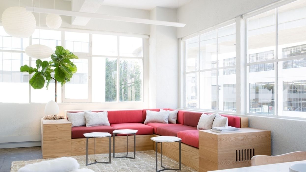
Mighty came with a vision for an interior that was modern, crisp, light, and airy. They needed functional spaces for different modes of working, where they would also feel at home in every room. "We created a living room where you can couch surf all day long, a common room with multiple standing desks, a couple of glass-encased conference rooms, and a cozy quiet room to take naps and write," Parina says.
"This group was a total dream," says Hatch principal Kate Hanzo, who set out to highlight Mighty's brand story and essence through a clean design with colors that pop.
"Mighty PR came with a very strong sense of their company identity—their mission, values, and their overall vibe as a bold and fun group," Hanzo recalls. Each area needed to foster creativity and inspire collaboration. "The design needed to be elevated to match the caliber of work they had grown into, with an impressive clientele and innovative portfolio." And naturally, they wanted to make a statement with their signature crimson hue.
"We wanted their Mighty red to act as a bold punch by reserving it for one key impact area," says Hanzo, who tricked out the teams beloved lounge with with plush, scarlet sofa cushions. The meeting spaces also got hits of color: "We knew that a strong rich color on the walls of the conference rooms would instantly command the attention that their brilliant work deserves. We also let the simple, industrial bones of the space inform the overall simple white wall color, allowing the beautiful raw concrete floors to take center stage."
Hatch hopped on the design process before Mighty took over the space and worked closely with the team and landlord to make improvements that included removing the old carpet and refinishing the raw concrete floors beneath; designing the new kitchenette millwork; and planning the new conference room layouts. Driven by the desire to create comfortable working, gathering, and lounging environments for the team to frequent throughout the day, Hatch ensured that each space would feel inspirational, whether it was a place to retreat for some solo time, a corner to gather for a quick meeting, or areas to convene and stay for longer group sessions. The area Hatch is most proud of, though, is the large conference room.
"We were immediately drawn to the original old factory windows, and the dark painted walls really allow them to pop," says Hanzo. "The contrast of the dramatic crisp white conference table against the dark walls is striking, and the overscale [Isamu] Noguchi pendants create a lovely ambiance that feels warm and residential."
// Mighty PR, 329 Bryant St. Suite 4D (SoMa), mightypr.com; Studio Hatch, 3007 Galindo St. (Oakland), wearehatch.com