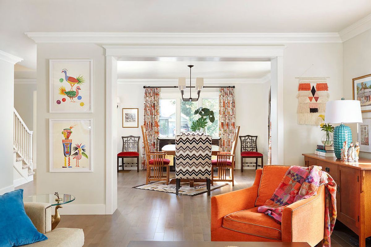
After a much-needed makeover, this old school home becomes a bohemian gem.
Once Joan Schubert and David Fletcher outgrew their home, they decided to return to the Sacramento neighborhood where Schubert grew up, and where she still has family. But before they could move into the 1930s Tudor-style house, the couple needed to do a major renovation.

Houzz at a Glance
Who lives here: Joan Schubert; David Fletcher; their son and daughter, ages 3 and 8; and Howard, the family's Cairn terrier
Location: Historic William Land Park neighborhood of Sacramento, California
Size: 2,800 square feet (260 square meters); three bedrooms, four bathrooms
Designers: Laura Neuman of PepperJack Interiors and Sarah Ellis of Ellis Architects
The house hadn't had any work done in decades and "needed a top to bottom renovation," interior designer Laura Neuman says. She took every wall down to the studs and completely reconfigured the layout, which is why the before-and-after photos won't appear to match up in this article.
New replacement windows, electrical wiring and plumbing were installed throughout the home. The former living room, shown here, looked dated and felt small and closed off. The small windows also didn't allow in much natural light.

Major floor plan changes reworked the front area into a new foyer, stair landing, hallway (on the far left) and dining room. The staircase leads up to the kids' bedrooms and bathrooms on the second floor. Framed openings with molding create a more authentic Tudor look than the previous unadorned openings.
Because of the drastic configuration changes, the entire home needed new flooring. Wide-plank maple wood with a grayish tint replaced original oak.
Neuman created a neutral, cool palette for most of the finishes, then added splashes of vivid color in the fabrics, artwork, wallpaper and kitchen cabinetry.
In the dining room she mixed a Navajo rug, vintage African spears and a carefully edited collection of different dining chair styles: Chippendale, Mission and upholstered host chairs. Drapery fabric features Chinese pagoda motifs in oranges, pinks and blacks.
"It's so easy to slip into doing something trendy and 'of the moment,' but this finished home transcends any trend or single narrative and makes a unique statement about the homeowner, while at the same time remaining flexible to grow and change with them through the years," Neuman says.

New double doors on the rear of the family room open to the backyard and bring in natural light.
Neuman mixed vintage finds, like the homeowners' orange velvet chair, with new pieces, such as the green Chinese bench, contemporary coffee table and wall-hung decorative baskets. Adding a delightful wave-like pattern without being overwhelming, the orange and white shade fabric was hand-printed using Indian blocks and hand-embroidered.

The 1970s kitchen had seen better days. The former kitchen walls were largely reconfigured to create a more contemporary, open layout.

Neuman had these vintage-inspired wood cabinets custom-made to complement the overall project palette of oranges, magentas and reds with touches of greens and blues. She selected the playful, multicolored shade fabric to tie it all together.
A white subway tile backsplash features an additional linear-patterned accent strip by venerable tile company Rookwood Pottery. Neuman says she selected Rookwood because of its association with the Arts and Crafts movement. However, she gave it a contemporary twist by going monochromatic rather than using the traditional greens and reds.
A casual breakfast area bridges the new kitchen and family room.

For the master bedroom, which sits off the foyer, Neuman brought in touches of tropical, African and Mission styles, and unified them with a thread of black. The throw on the bed is a hand-woven Ethiopian textile. Light wool wall-to-wall carpeting gives a cozy break from the wood flooring found elsewhere in the home.
Schubert displays and stores her collection of scarves on a nearby wall.

A vibrant Tim Collom art piece hangs from the ceiling above the bathtub, allowing the homeowners to avoid drilling into the subway tile on the wall.
To work around space constraints, Neuman positioned the vanity beneath the window and hung a round mirror from the mullion.

The designer turned the former detached garage into a home office and party overflow space, adding a new concrete floor and heating and air conditioning. A vintage pelican statue in the foreground on the left holds pink paperclips.
The office consists of an open desk space, a small kitchenette, a toilet area and storage tucked behind a sliding barn door.
Howard, the family's Cairn terrier, likes lounging on the cool concrete floor.
Next to the kitchenette, a cheerful lacquered cabinet provides ample bar storage.

A plan of the home's first floor illustrates the new layout. The master bedroom and bath are at the front right, the kitchen at the rear right, the dining room at the front left, and the family room at the rear left. The cottage is at the exterior far right of the home.
This article was written by Karen Egly-Thompson for Houzz.
You might also like:
Love Patterns? See Why Chevron is the Right Fit for You


