Unlike the McMansions we see today, 20th-century architect William Wurster's homes for the rich were known for their simplicity. "It was all the simplicity money could buy," jokes architect Lewis Butler, who has remodeled more than 10 of Wurster's homes in the San Francisco Bay Area.
Wurster built this particular home in 1939 in San Francisco's Pacific Heights neighborhood for Walter Haas, longtime CEO and chairman of Levi Strauss & Co. Despite passing through several hands and undergoing a couple of renovations, the house was still in fairly original condition when an entrepreneur bought it in 2011. "He loved the house, and he loved the whole idea of it," says Butler.
Butler and his team, including architect Reba Jones, helped the client reimagine this architectural masterpiece into an artistic modern-day abode that reflects Wurster's simple architecture.
Houzz at a Glance
Who lives here: An entrepreneur and his family
Architect: Butler Armsden Architects
Location: San Francisco
Size: 5,300 square feet; 3 bedrooms, 3 full bathrooms, 2 half baths
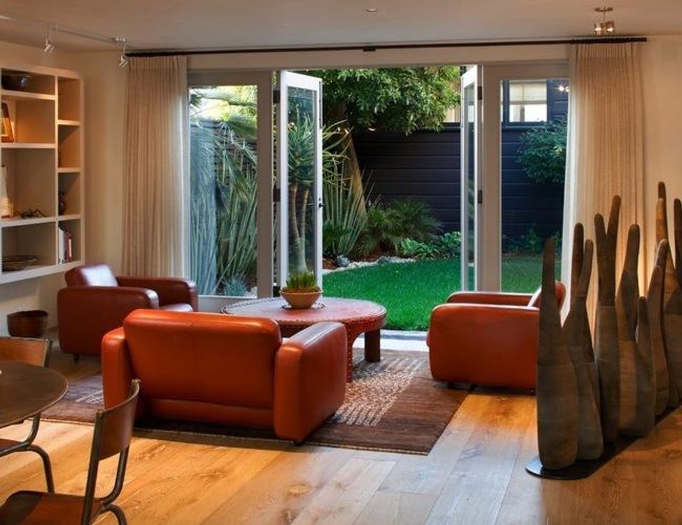
The main entrance from the courtyard opens up to this piece of custom art by Thierry Martenon. Each wavy wooden "finger" is attached to a metal plate with a magnet. Club chairs: vintage, Tobia Scarpa; coffee table: client's own. (Butler Armsden Architects, original photo on Houzz)
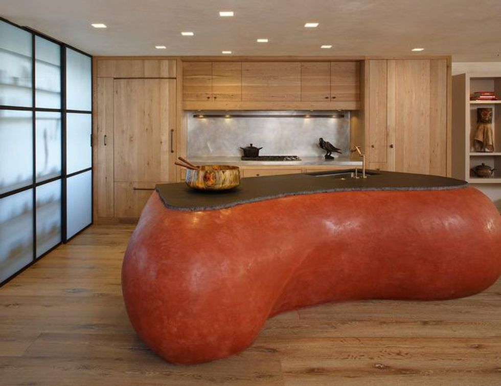
Kitchen cabinetry: oak, custom; counter, backsplash: zinc; island top: basalt. (Butler Armsden Architects, original photo on Houzz)
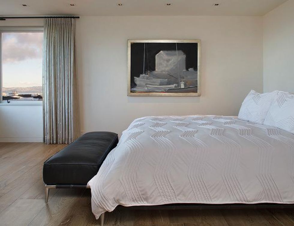
The master bedroom. (Butler Armsden Architects, original photo on Houzz)
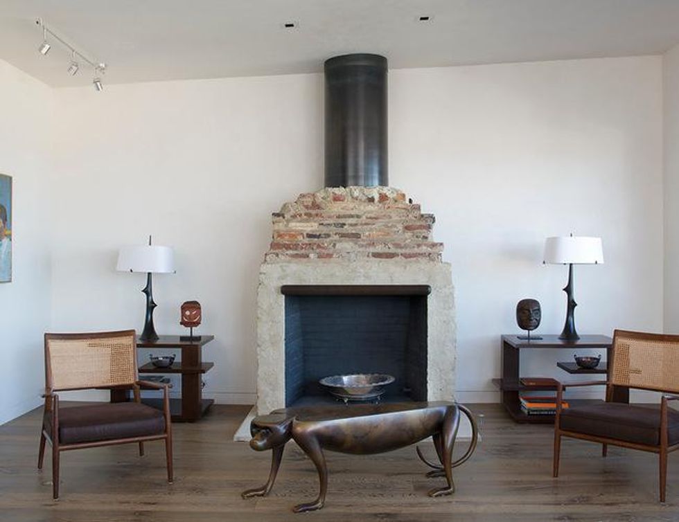
Monkey coffee table, lamps, chairs: vintage, client's own. (Butler Armsden Architects, original photo on Houzz)
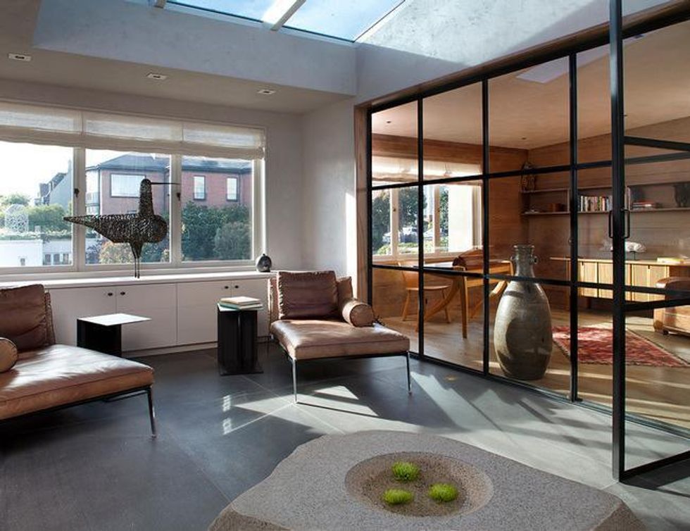
Lounge chairs: Happy by Antonio Citterio, Flexform; side tables: Plain by Antonio Citterio, Flexform; wire bird sculptures: vintage, Birgir Kaipianen. (Butler Armsden Architects, original photo on Houzz)
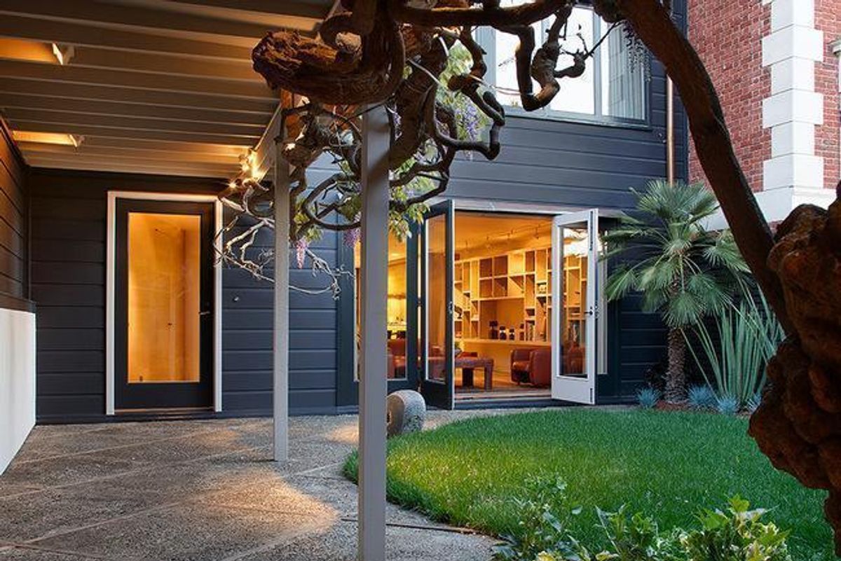
The house, set back on its lot, feels extremely private despite its urban setting. A south-facing courtyard lies between the house and a separate studio. Renowned 20th-century landscape architect Thomas Church designed the serene courtyard, and the curving lawn shape, concrete paving pattern, covered walkway and winding wisteria are all original. The homeowner worked with Patrick Lannan at Flora Grubb to supplement the original design with contemporary plantings.
Although the rest of the home's original layout remains the same, Butler and his team gutted this floor to create a great room, a sitting area open to the courtyard. "The entire house has a complex indoor-outdoor relationship," says Jones.
The team and the homeowner worked together on the design of the sculptural kitchen island, viewable from the entry; it was inspired by the owner's trips to Australia. Tadelakt plaster forms its contours; it's topped by a basalt counter with a chipped edge.
Jones and Butler used square recessed lights in lieu of traditional round lights throughout the home. On the main floor, the lights were installed on a skewed grid that aligns with the main entrance. "We didn't want a grid of lights on the ceiling all aligned with the floor plate," says Jones. "That would've been too expected."
Next to the kitchen, a pantry with translucent panels and basalt and metal shelving allows light to enter the kitchen without giving neighbors a direct view into the house.
The master bedroom has a view of the neighborhood and the San Francisco Bay. Butler and Jones allowed this stunning scene to dominate the room by keeping the architecture and decor simple. New plaster, hewn oak flooring and drapes draw attention to the window.
Cabinets had previously flanked the exposed brick fireplace in the top-floor living room. The owner loved the fireplace's craftsmanship — including the bricks with the fingerprints of the original mason — so Butler and Jones removed the cabinets to highlight this feature. A new metal flue adds an industrial edge.
A skylight illuminates a sitting area and an office on the top floor. A glass and metal wall, similar to the translucent panels in the pantry and basement, separates the room. "This house has a very interesting concept of space," says Butler. "Sometimes it's open, and sometimes it's closed. It's part of what was a very artistic vision for the house."
Although the home's remodel was significant, Butler and Jones left as much of the original architecture and as many details as they could. "It's very reminiscent of the original house, but it feels fresh," says Jones. —Vanessa Brunner, Houzz
You might also like:
Hire a San Francisco Landscape Design Professional
Make a Unique Kitchen Island the Focal Point of Your Kitchen
Find Recessed Lighting in All Shapes and Sizes


