Sometimes you don't know what you want until it's right in front of your face.
Pamela Lin and her husband, Erwin Tam, had set out looking for a run-of-the-mill, contemporary cookie cutter home with two stories that they could move into without much renovating. But none of the dozens of homes they toured wowed them. Until they walked inside a home designed by well-known California developer Joseph Eichler.
Seeing the open-sky atrium surrounded by floor-to-ceiling windows and the open floor plan, Lin and Tam's style compass completely shifted. Turned out, they weren't lovers of contemporary style at all; they were midcentury modernists at heart. "Right away we knew this home was for us," Lin says.
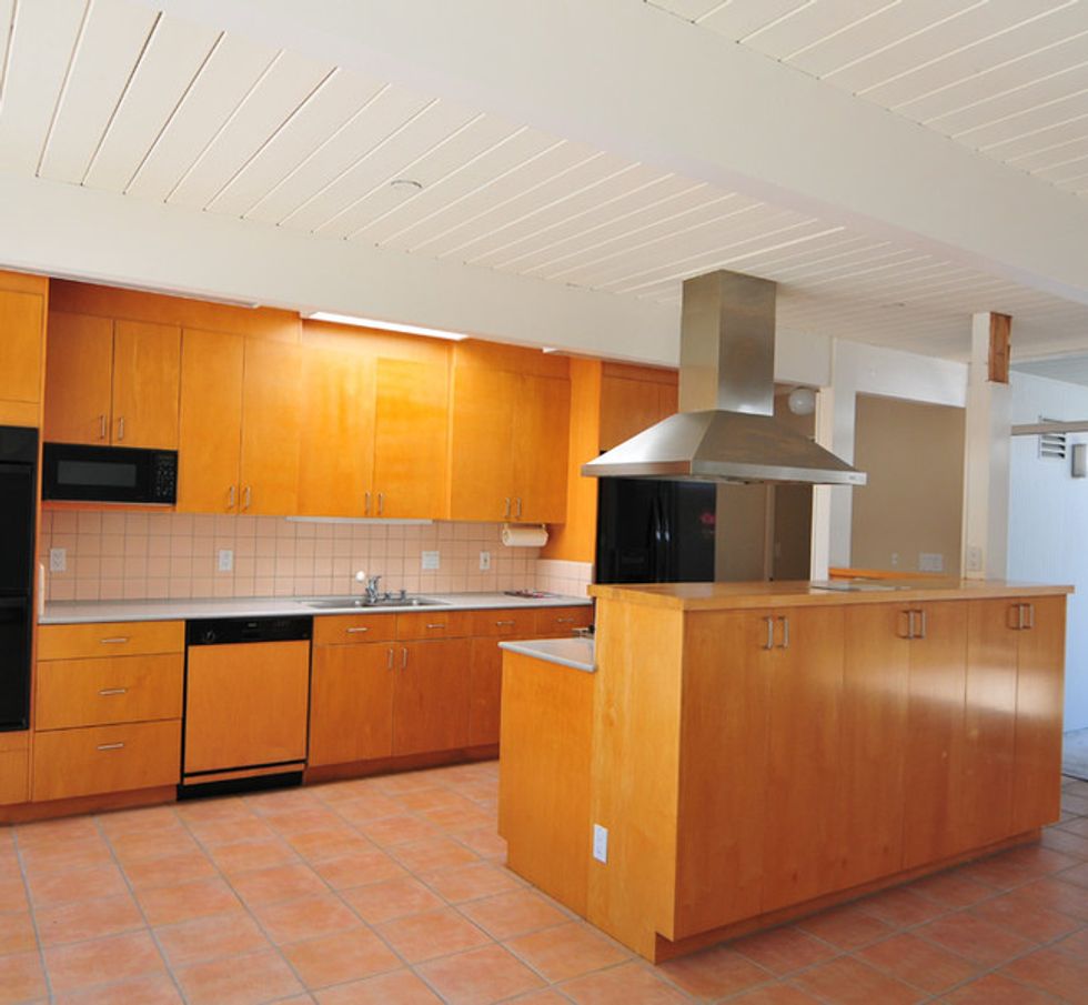
Another thing they soon discovered: Lin is a natural designer. A full-time project manager for Google at the time, she reached out to a few professionals, but her tastes were so particular that she just decided to design the whole house herself, reimagining the kitchen and bathrooms and choosing furnishings, materials and paint colors. Two of her fellow Googlers saw the end result and each hired her to do their homes. Then a neighbor's friend saw the house, knocked on her door, and hired her. After that, a different neighbor procured her services as well.
With such demand, Lin decided to start her own interior design company, Urbanism Designs.
Houzz at a Glance
Who lives here: Pamela Lin, Erwin Tam and their daughters, Eniko (8 months) and Eliana (4)
Location: Sunnyvale, CA
Size: 1,890 square feet; 4 bedrooms, 2 bathrooms
(Before Photo, original photo on Houzz)
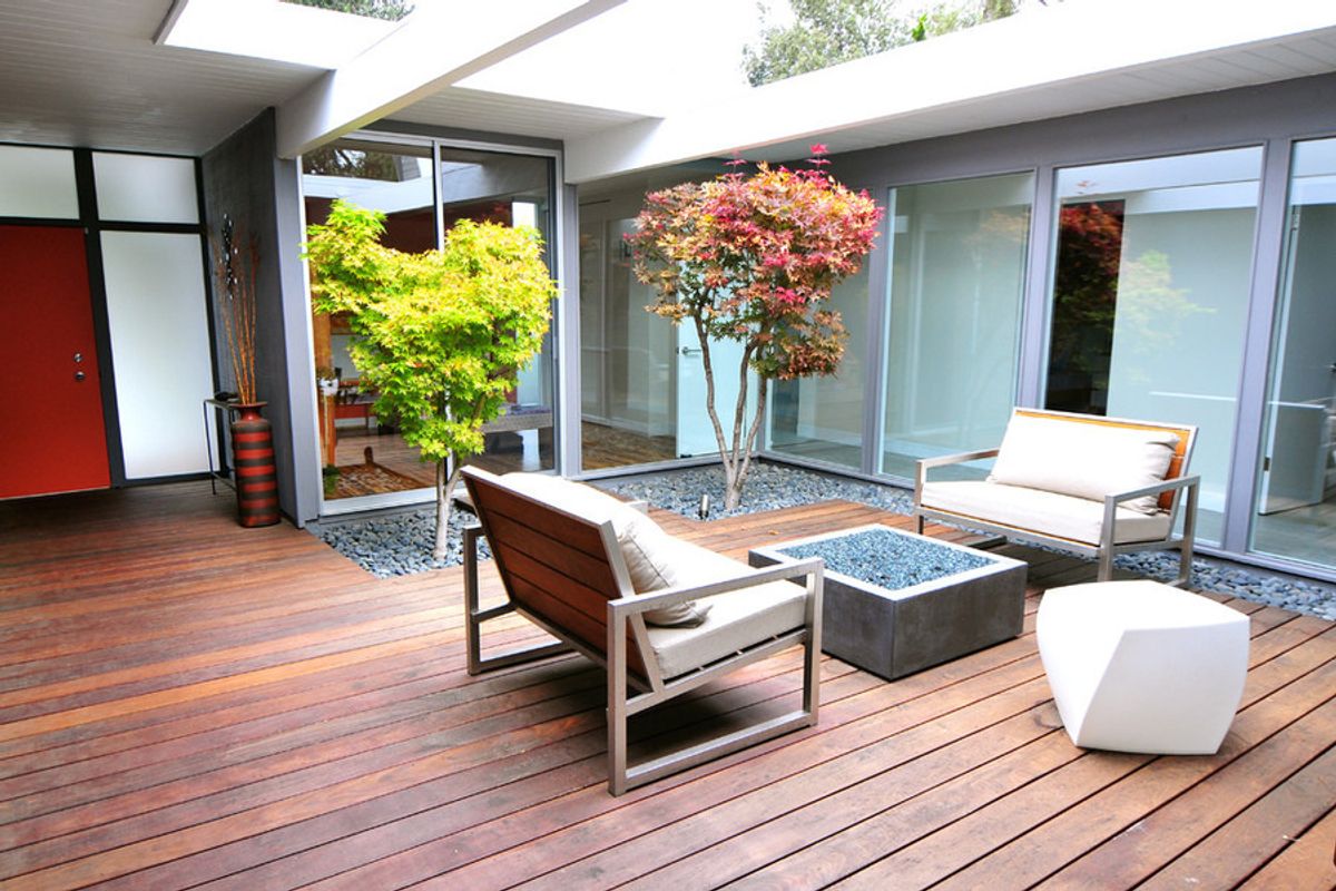
BEFORE: The front door opens to this atrium, which originally wooed Lin and Tam into buying the house. In their research they saw that many people opted to cover Eichler atriums to add more interior square footage, but they chose to preserve it.
Lin believes a wood wall originally separated the interior and exterior and that a previous homeowner changed it to frosted glass.
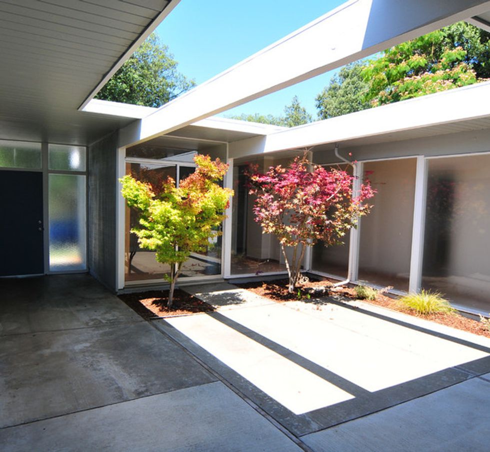
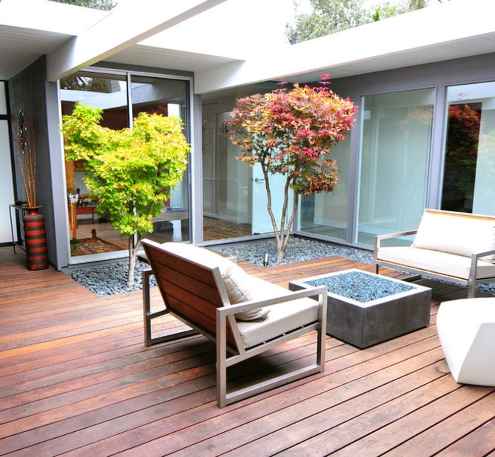
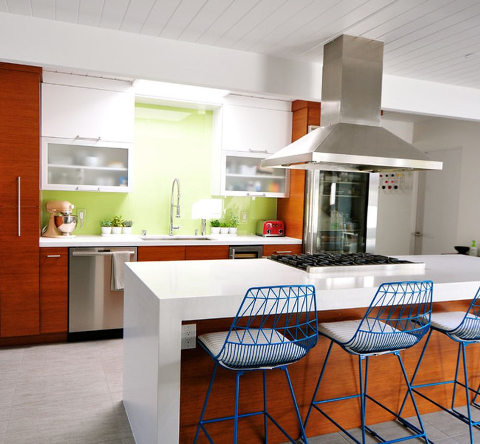
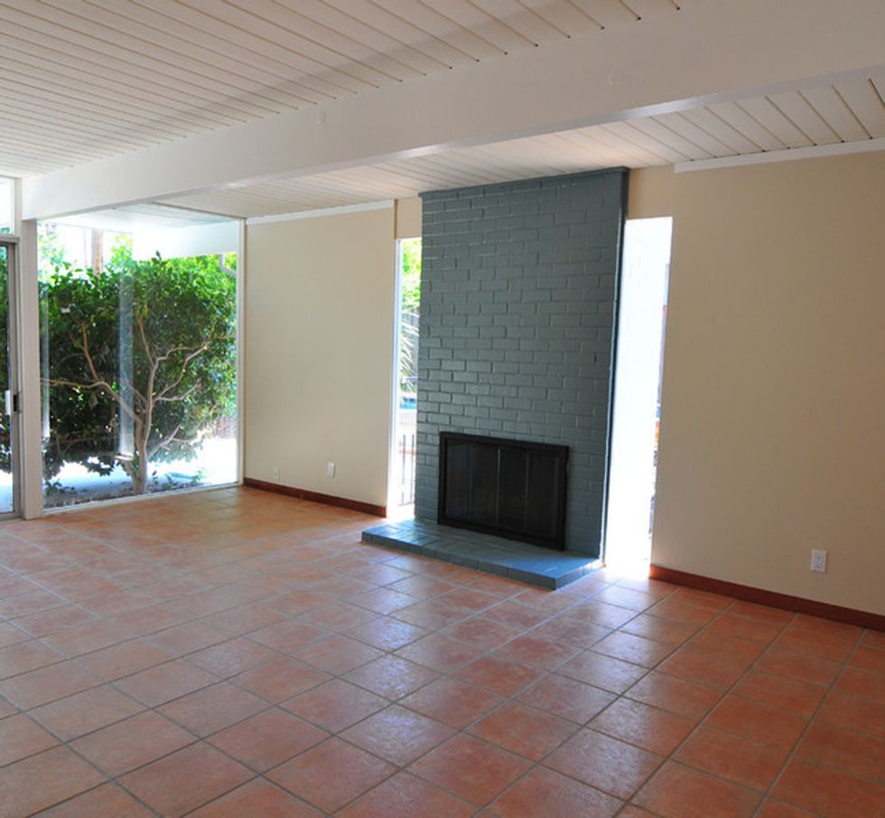
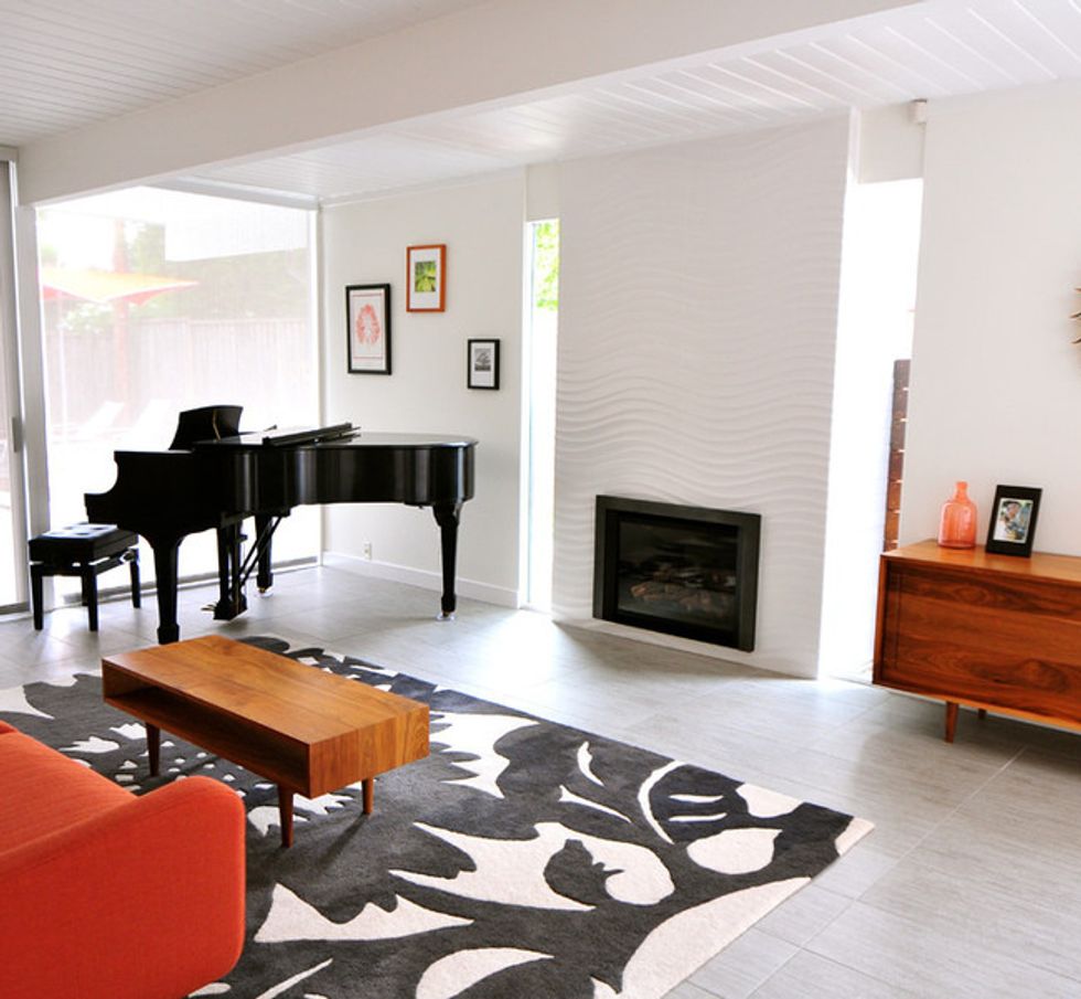
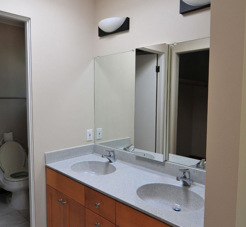
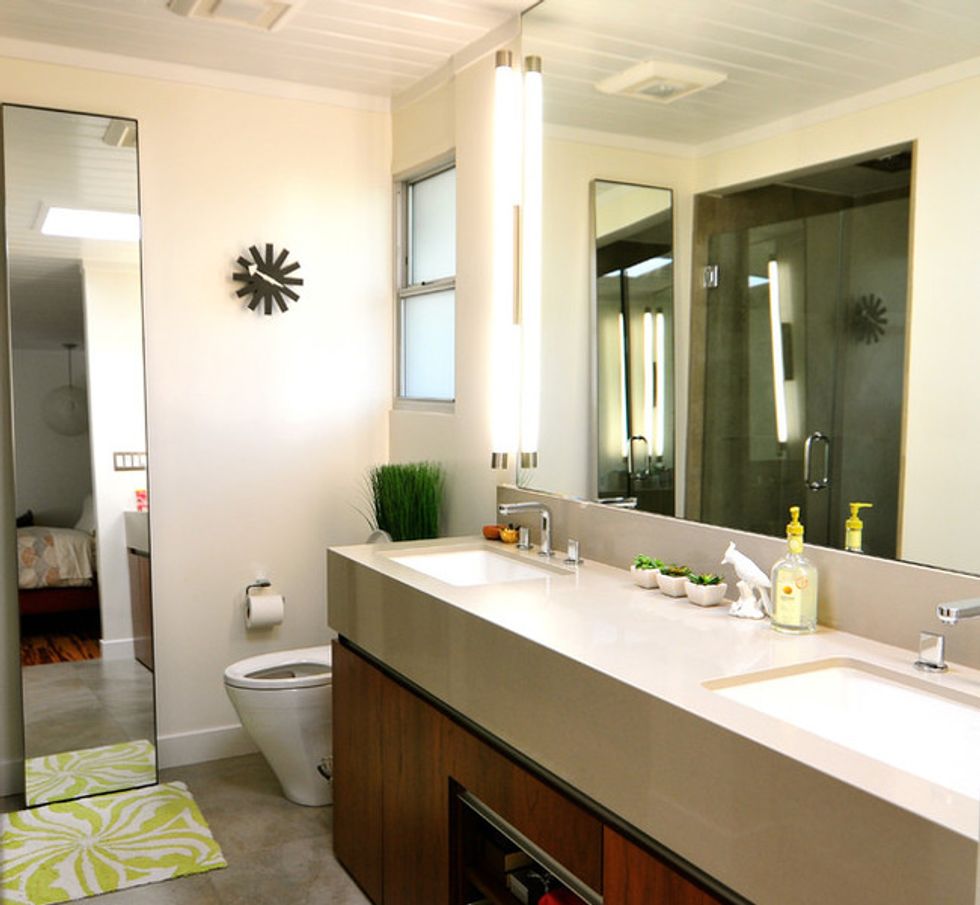
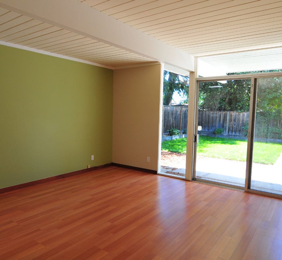
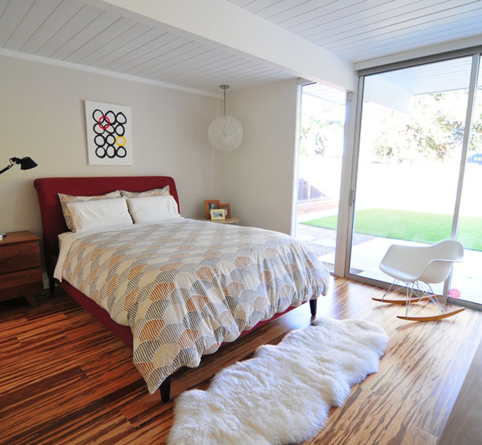
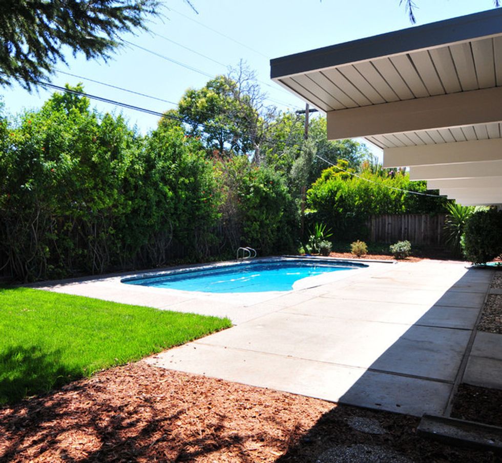
Lin researched Eichler homes because she wanted to preserve the Eichler feel but modernize it slightly. Previous owners had already altered a few features — they had removed some original interior wood paneling and painted the ceiling, for example — but she tried to keep the structure as original as possible. "We tried to preserve as much as we could and just modernize things without losing the structure and bones," Lin says.The exterior form is virtually unchanged apart from new paint. Lin also added frosted glass to the front door sidelight, changed the side fence to ipe wood and added landscaping steps and concrete planter boxes, which she designed based on a photo she saw on Houzz.
The atrium leads to the kitchen, where Lin removed a partial wall that had blocked views inside. With that and the frosted glass removed, this outdoor space has become a focal point.
Despite her nascent venture into design, she says she had a strong first run. "I didn't return anything; I just based everything off feel," she says. "Maybe that's why people are telling me I should do this. It just felt natural to me. Everything in the house is just what we picked. There was no trial and error."
She originally wanted poured concrete floors, but found textured tiles with a nonslip surface for her two small girls; they helped her stay within her budget and still provide a modern gray tone.
Lin got color, layout and furnishing ideas from Houzz, and also used the site to research Eichler and other midcentury modern designs for inspiration. "Scrolling through photos gave me ideas on how I should do certain things," she says.
Previous owners had designated the space connected to the kitchen as a dining room, but Lin felt like it was way too much space. She turned the area into a TV room and transformed a spare bedroom off the main living room into a formal dining room.
The Saarinen table and chairs in the dining room are all original. The other chairs are Eames originals, as is the George Nelson Crisscross Bubble Lamp. "If I'm going to buy iconic designs, I want them to be original," Lin says. "I have to give them credit."
In both 8-month-old Eniko's and 4-year-old Eliana's room, Lin commissioned paintings from artists she found online. "I like to support artists who are trying to make it," she says.
A bonus room became the kids' playroom.
// This story was written by Mitchell Parker, and originally published on Houzz.
You might also like:


