Nearly 26 years ago, Geoff Lomax's brother turned to him as they stood outside the 1929 Mediterranean-style home they had just bought together in Berkeley, California. He pointed to the roof and jokingly said, "That's where a rooftop deck could go."
Kidding or not, the observation stuck with Lomax for more two decades, during which time his brother moved overseas, leaving Lomax with the house. He married Sabina Aurilio shortly after and they had a son, Marco. Meanwhile the home had been steadily falling into disrepair. The ceilings were cracking and leaking. The foundation was shot—not something you want in earthquake country. And the landscape was severely overgrown.

Houzz at a Glance
Location: Berkeley, California
Who lives here: Geoff Lomax, who oversees grants for stem cell research; Sabina Aurilio, a learning specialist; and their 12-year-old son, Marco.
Size: About 1,300 square feet (120 square meters); 3 bedrooms, 2 bathrooms
Cost: $500,000
They decided that if they were going to fix up the house, they were going to stay in it forever, and would invest in making it last—do the original home justice and focus on their personal interests rather than on what future buyers might want. After saving money for nearly a decade and building more equity in the home, the couple hired Kerstin Hellmann of Sogno Design Group to take the home down to the studs. Working with Berkeley Craftsmen as general contractors, they then rebuilt the foundation, overhauled the kitchen and added two new bedrooms. And they created a stunning rooftop deck with views of the San Francisco Bay and a dumbwaiter to carry meals up from the kitchen.
Hellmann opened up a former guest bedroom, pushed the ceilings to double height and added 12-foot windows to create a sunny office that acts as a transition space between the main living floor, the new rooftop deck, the master bedroom and Marco's room. "Someone is always in this space playing games, doing homework or using the computer," Hellmann says.
She envisioned a home with lots of beautifully finished woodwork, so she tapped furniture and cabinet maker Marc Waidelich to build lots of custom cabinetry, including the cherry units seen here. "It was really worth it," Lomax says. "Every possible ounce of space is usable. We now have bookshelves, nooks and crannies. There's no space in the house that isn't functional and usable."
The window seat is about 9 feet long and 3 feet deep. Lomax and Aurilio can put a cushion on top and pull out pillows and blankets from the drawers below for an extra sleeping spot when they have spillover guests.
None of the fir windows in the home have any trim, for a more contemporary look. The upper windows here are operable to help vent out hot air.
A staircase leads up to the rooftop deck and the new bedrooms to the right. The flooring is solid oak.

The new rooftop deck (above, in the foreground) was built over the kitchen, which allowed the homeowners a dumbwaiter to ferry up drinks and food from the kitchen, and ferry down dirty dishes and glasses from the deck. "It's especially more safe to use than the stairs after a few bottles of wine," Lomax says. The dumbwaiter is housed in the kitchenette at the back of the outdoor space. The kitchenette also has a sink and a wine fridge.
To the right is the landing at the top of the stairs that leads to the office. To the left the deck opens to the new master bedroom. Both spaces can be closed off from the roof deck — the right side with bifold glass doors and the left with French doors.
Ipe on steel frame awnings helps reduce glare and heat gain. The awnings also provide a spot to mount exterior lights. Lomax did the lighting design for the house and even built a few of the lights himself.
The French doors at right lead to the master bedroom. On the deck floor, 2- by 2-foot ipe tiles from Bison can be lifted up to clean underneath, where waterproofing protects the house from leaks.
Parapet walls around the outside perimeter of the deck provide a bit of privacy from the street as well as a place to put ambient lights.
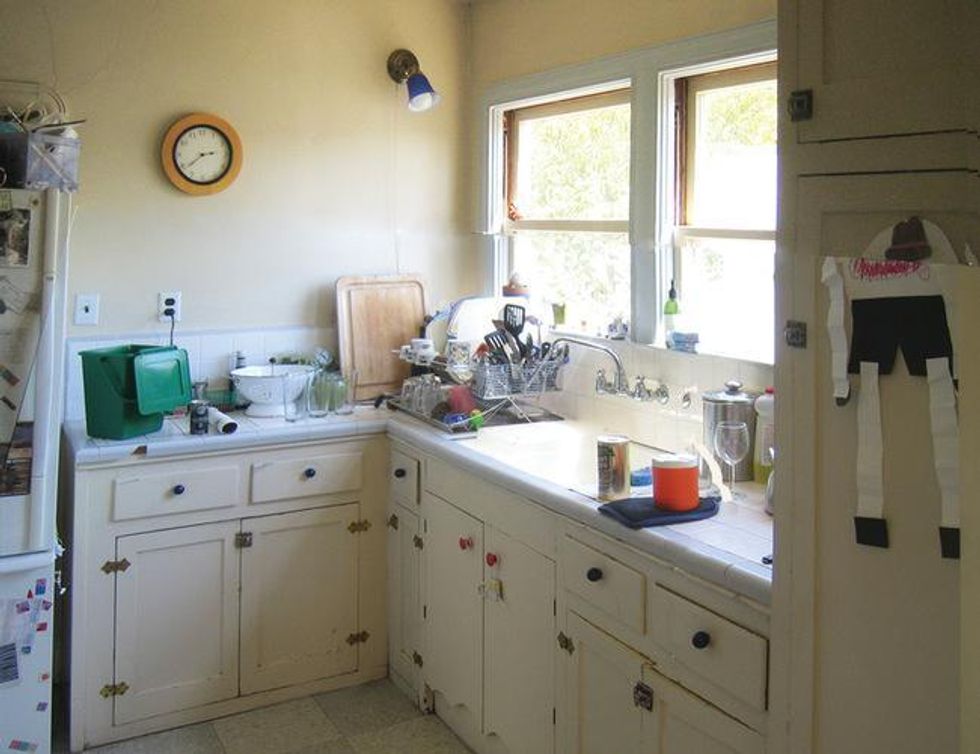
BEFORE: The existing kitchen was probably original to the home. The painted cabinets were in need of replacing, there was very little counter space, and there was no dishwasher.
(original photo on Houzz)
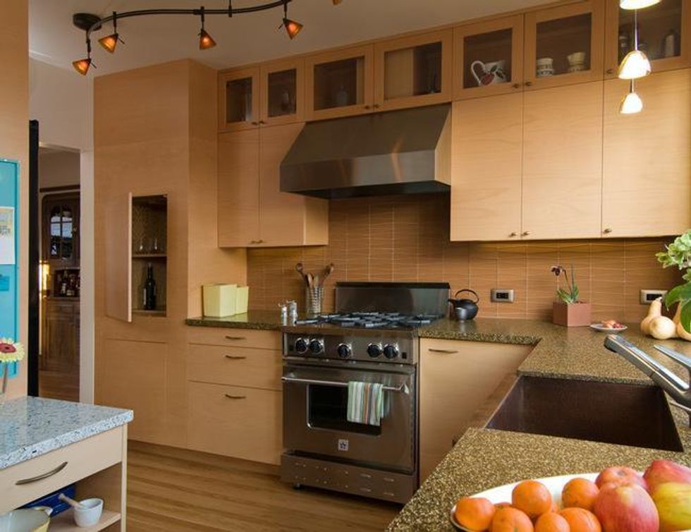
AFTER: Aurilio was heavily involved in the kitchen overhaul. She chose most of the finishes and hardware. Waidelich custom built the cabinets out of beech wood.
(original photo on Houzz)
In the kitchen, new picture window is centered over a copper sink. With all the western light pouring in, the homeowners wanted to keep the finishes as matte as possible to prevent glare.
The main countertop is acrylic resin with recycled aluminum shavings, from Alkemi. Lomax and Aurilio were nervous about using the product, because it wasn't rated for kitchen use, only for commercial restaurant bathrooms and bars. To test it, Aurilio ordered sample pieces and proceeded to try to damage them as best she could — cutting on top of the pieces with sharp knives, dropping hot pans on them, setting a scorching-hot cast iron pan down on top of one piece, even asking a friend of a friend to stub his lit cigarette out on one.
"The only thing that damaged them was cutting tomatoes with a serrated knife, which is easy to avoid," she says. "We don't put hot pans down, either."
They both love to cook; Lomax is the grill guy, and Aurilio handles desserts. For baking she chose a terrazzo countertop (seen on the left) that's recycled glass in white concrete. The material is seamless and stays cool, both of which are good features for working with doughs and pie crusts. The countertop sits lower than standard so the 5-foot-2 Aurilio can more easily roll dough and make her tarts, cookies and cakes.
The opening to the dumbwaiter can be seen to the left of the stove and counter.
Stove, hood: BlueStar

The homeowners really wanted to preserve the living room and its barrel vaulted ceiling as much as possible. "Our operating principle was 'Keep it as it is,'" Lomax says. After opening up the house, he learned that the home was really well built, with wide Douglas fir arches in the living room ceiling. He even found an old lumber receipt in the walls that hinted at the effort to use expensive materials. "Whoever designed it was really a clever, true craftsman, nothing off the shelf," he says. "So we wanted to do this place justice."
They replaced the cracked ceiling and peeling wall plaster, as well as all the windows, which, again, were made to match the originals as much as possible.
Painted sconces in the corner blend into the walls and highlight the ceiling curve.
The new cherry cabinet was once closet space in the bathroom on the right but was annexed to create a drop zone. There's a spot for mail and a mini coat closet, and there are drawers and a cubby for backpacks.
The stairs lead up to the new office, deck and bedrooms.

The new master bedroom had to be raised because of the arched ceiling of the living room below. Hellmann designed drawers 4 feet deep to store things like suitcases.
The couple shares the new bathroom with their son. Waidelich built the ipe bench, which can be raised up while someone is showering. The tile is quartzite.
Because the water heater is on the other side of the house, it takes a couple of minutes for the shower to heat up. Wanting to find a way to preserve that cold water, which, with a low-flow showerhead, equals 5 gallons in two minutes, Aurilio says, the couple looked out the window and realized their rain barrels were sitting directly below. They talked to their contractor and had a gutter installed so they can put the handheld showerhead out the window (seen in the previous photo) and into the gutter to collect the water.
BEFORE: Here's a look at the overgrown landscaping at the front of the home. The wooden retaining walls were starting to fail, and the foundation was showing signs of sinking
(original photo on Houzz)
AFTER: The yard was dug out and the landscaping replaced with new drought-tolerant plantings. The foundation was ripped out and replaced. The stucco was redone and repainted, and new lightweight shingles that fit with the Mediterranean style of the home were added.
(original photo on Houzz)
Lomax estimates they spent $500,000 on the project, including appliances, cabinets, design fees, labor and materials.
Architecture: Kerstin Hellmann, Sogno Design Group
General contractors: Berkeley Craftsmen
Steel fabricator: Oliver Beckert
Plasterwork: Crana Plastering & Stucco
Cabinets: Marc Waidelich
Tile installation: Nandi Devam
// This article was written by Mitchell Parker and originally published on Houzz.
You might also like:
Create Your Own Beautiful Rooftop Deck with a Professional Deck Builder Now
Explore More Kitchen Countertops Here
Find the Best General Contractors to Get Started on a Remodel With


