Conventional wisdom has it that when children leave home, parents downsize. But some recent articles on Houzz have floated another idea: couples choosing to move into a bigger home after the kids fly the coop.
The reason is that when those offspring leave, they tend to return with new members of the tribe—their own spouses and children. This couple built their dream home after the last child moved out, and they were determined to make the new place the family home. The challenge was that the family members had more than doubled. They hired architect Ani Wade and designer Jennifer MacDonald to create a haven for their growing clan.
Houzz at a Glance
Who lives here: A couple who regularly entertain their four children, their children's spouses and nine grandchildren
Location: Northern California
Size: 6 bedrooms, 6 bathrooms
This couple had the unusual benefit of knowing the site for their new home like the backs of their hands. "They lived on this property for more than 25 years, and they raised four children here," Wade says. When they decided to make the location the site of their new house, a dream house they'd been thinking about for years, they worked with their architects to create a dwelling whose style is hard to name. When pressed, Wade came up with the term "updated ranch house," a label she's reluctant to give, but one she says fits better than most.
The updates include a much, much higher ceiling than one in a traditional ranch. But the idea of a strong connection to the outdoors remains intact.
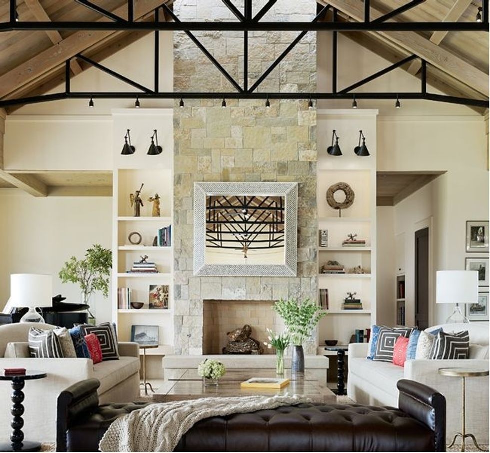
Many midcentury ranchers are modest in size, and this concept has been modified to fit as well. "We were in the position of creating a living room that would accommodate 24 people without moving furniture around," Wade says. "We also had to make sure the dining room would accommodate that many people."
To understand how carefully the owner (a wife, mother and grandmother) planned her new home, and the lengths she went to in order to accommodate every member of the family, consider this: Even the place for the Christmas tree was plotted to perfection. It sits in the neighborhood of the piano on the left, and because they knew exactly where the holiday icon would stand, the architects were able to embed floodlights in the floor. Come December, these halls will be decked.
The desire for high ceilings came from the couple, and the architects added the black metal-and-wood trusses. Wade says the dramatic structures perform the very real function of holding the roof up. (These days, it's common to add similar structures for decoration only.) They also act as a scaffolding for lighting and put the room on a human scale.
MacDonald says the home's look is defined by a simplified palette, natural organic textures and a focus on indoor-outdoor living. She says these elements and the down-to-earth style came from the homeowners. "She came to me with a nice collection of imagery, a very tall stack of pictures. She was drawn to colors and graphics. She wanted an interior that was really fun," MacDonald says. "She had been thinking about this project for at least seven years."
The designer also says the couple wanted an interior that wouldn't become outdated. "We provided a background that is neutral, but then filled it with accessories that are pomegranate red, blue and green — the woman's favorite colors," she says. "If she should want to change the look someday, she can do it easily by changing out the accessories."
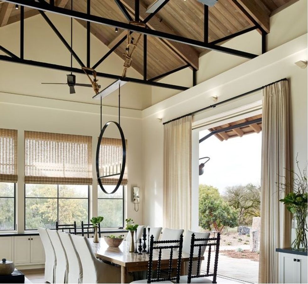
The owners wanted to make sure that the dining room could seat the family during special meals. For much of the time, the space that's open to the living room is home to a 12-foot table. But for those occasions when there's a full house, the designer created two 5-foot-5-inch-long extensions that can be rolled in from the garage to make it a table for 24.
But the problem was that when the table was elongated, the chandelier MacDonald designed was off-center. To balance things out, she commissioned a smaller sculpture that sits on the table and mirrors the circular hanging light fixture. "To picture it, imagine you take the light fixture, flip it upside down and stand it on one end of the table," says MacDonald.
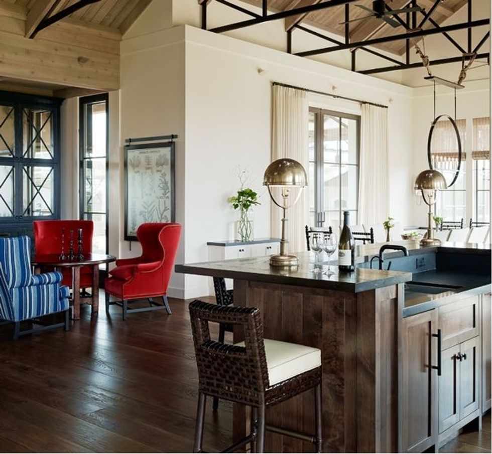
Entertaining is obviously important to this family, and the bar just outside the dining room speaks to that. "The husband in this couple really likes to serve his guests, and this bar allows him to do that," MacDonald says. "It was my job to make it elegant, but to also make it fade away. We didn't want to make it a statement bar; it needed to look more like furniture." The designer added library-like fixtures on each end to cast atmospheric pools of light during parties.
The small table surrounded by wing chairs is a dining spot for the couple when they are alone in the house, or during very small gatherings. "Part of the project was making the house fit for the two of them as well as the whole family," MacDonald says.
Speaking of built-ins that appear to be furniture, MacDonald created a pair of large cabinets that look like free-standing chests. Of course, they provide a lot of storage for linens and crystal glasses, but they also have an aesthetic function. "I think they make the space feel more cozy by bringing the scale down before you enter the kitchen," MacDonald says. She also notes that the X shapes in the cabinet doors mirror the shapes made by the ceiling trusses.
The couple wanted an eclectic look that encompassed global elements. The kitchen includes a striking backsplash that the designer likens to an African print.
Since a lot of planning went into where the family would gather and eat, it makes sense that much thought was given to the sleeping quarters as well. The bunk room has two walls lined with bunk beds (for a total of eight twin mattresses). MacDonald says that one of the owners, knowing that sheets on the upper bunk beds would be a pain to change, suggested covers that can be zipped on and off. When the kids come over, each one finds a sleeping bag rolled at the foot of the bed.
An adjacent bathroom opens to the pool area. Cubbies beneath the sink store the grandkids' swim gear, and hooks hung high and low are fit for kids of all sizes. To keep things organized, each family is assigned a towel color.
There are accommodations for the big kids too. Each of the four children has a bedroom with a private bath. Deep window seats with cushions are large enough to serve as extra beds for grandchildren who aren't ready for the bunk room.
No two children are alike, and the bedrooms each reflect a different personality.
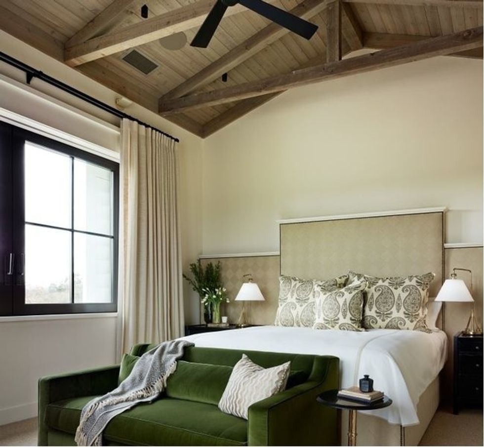
In the guest rooms and here in the master bedroom, MacDonald used long, upholstered headboards.
"They are very comfortable, and they add cohesion to a room," she says.
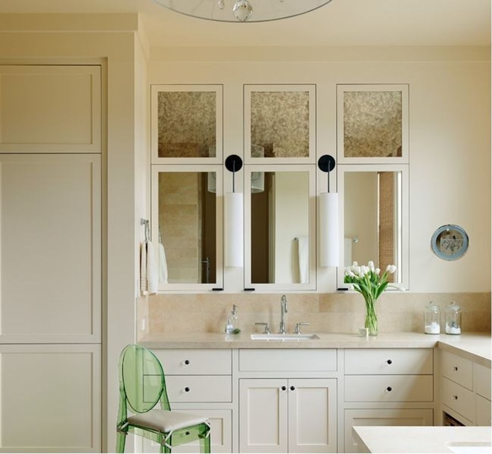
In the master bathroom, the designer used antiqued mirror on the upper part of the cabinets to vary the look and tie this room into others where the material is used. "I think it would make the doors look too heavy if we took the mirror all the way up," she says.
Looking at the exterior, you can clearly see the home has roots in a ranch house, with single story wings that are reminiscent of the classic style. And, like the best ranchers, it has a strong connections to the outside, which makes it easy for the family to move between house, yard, pool and fire pit.
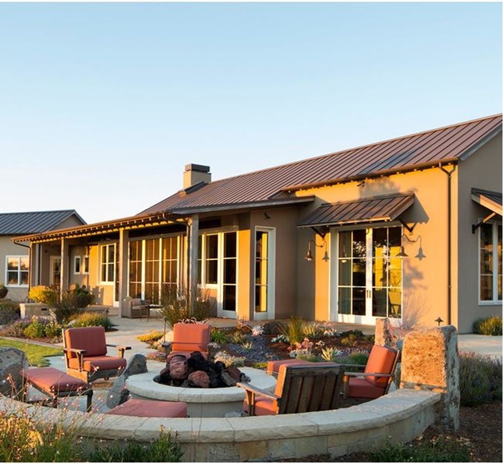
For MacDonald, this house is a success, and not just because of the material mix and furnishings. "I think the ultimate goal of a designer is to create a home that brings people together," she says. "This house is a place for the whole family — that's the whole point."
This article was written by Jo Bowling for Houzz.
You might also like:
How to Get That Midcentury Modern Look You Love


